Codefresh by Octopus Deploy · Senior Product Designer · 2024–2025
Redesigning a 7‑step DevOps flow that engineers actually finish
This wasn't a visual overhaul. It was untangling a technically complex, multi-tool onboarding flow — and making it work for engineers who already know what they're doing.
Codefresh Runtime Installation · Platform engineers & DevOps teams · with Oleg Turbovsky, Lead Eng
+90%
Runtime installations
Codefresh by Octopus Deploy · Senior Product Designer · 2024–2025
Redesigning a 7‑step DevOps flow and increasing installations by 90%
This wasn't a visual overhaul. It was untangling a technically complex, multi-tool onboarding flow — and making it work for engineers who already know what they're doing.
Codefresh Runtime Installation · Platform engineers & DevOps teams
Codefresh by Octopus Deploy · Senior Product Designer · 2024–2025
+90%
Increase in GitOps Runtime installations
Redesigning a 7‑step, four-tool DevOps installation flow
This wasn't a visual overhaul. It was untangling a technically complex, multi-tool onboarding flow — and making it work for engineers who already know what they're doing.
The handoffs in motion: the user leaves the UI for GitHub and the terminal — and Codefresh picks them back up the moment they return. Scrub or skip to any step.
Background
Why a self-service installation mattered
The goal was to transition Codefresh from a sales-led motion to product-led growth. The primary blocker to value: successfully installing the GitOps Runtime.
Without a Runtime on the customer's Kubernetes cluster, Codefresh can't connect to their infrastructure — every failed installation is a customer who never activates.
Discovery
Understanding the existing flow from the inside
Before designing anything, I needed to fully understand where users were getting lost — and why. I approached this in three ways: hands-on product audit, analytics, and direct input from the people closest to customer pain.
Heatmaps & click analytics
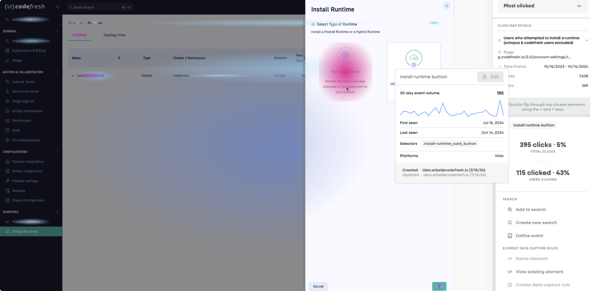
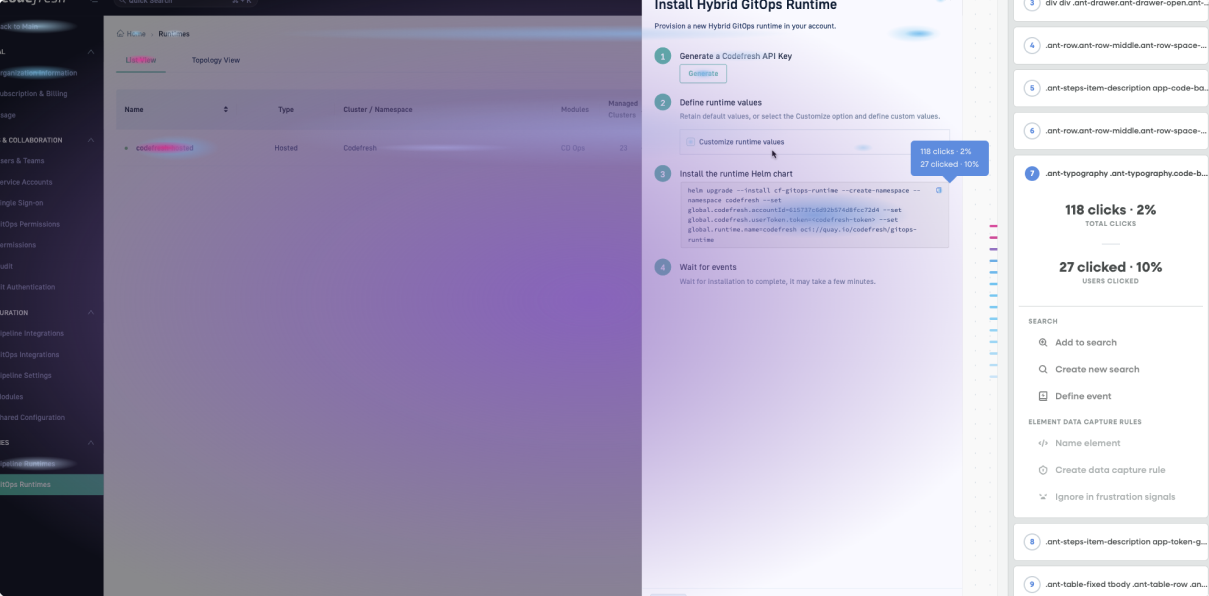
Heatmaps and click analytics showed exactly which steps users abandoned — and where their attention went when they got confused.
User journey map — across all four tools
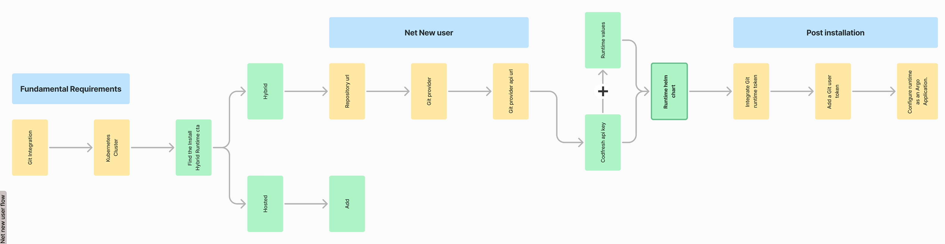
Mapping the full installation showed the user moving across four separate tools — Codefresh, the terminal, GitHub, and Kubernetes — while keeping track of tokens, commands, and config values at each step.
Customer Success & Implementation Engineers
I worked closely with CS and Implementation Engineers, who had first-hand knowledge of where customers got stuck: what questions came up in every call, what misunderstandings triggered the most support tickets. Their input shaped three specific design decisions: the empty state, the step structure, and the post-installation guidance.
One discovery from engineering changed the design significantly: the team was building a backend signal that could detect when the Helm command had started running in the terminal. That capability became the foundation for splitting installation into two distinct phases.
Three problems, three fixes
What was broken — and what changed
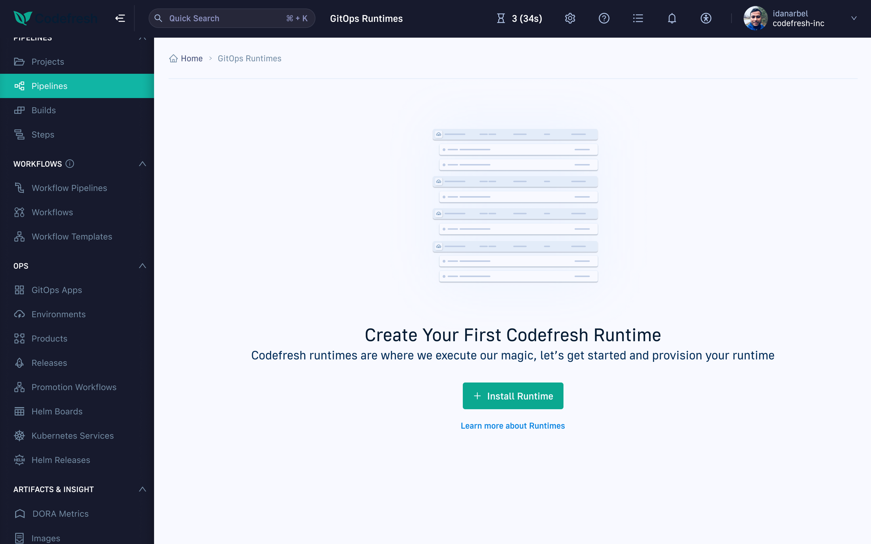
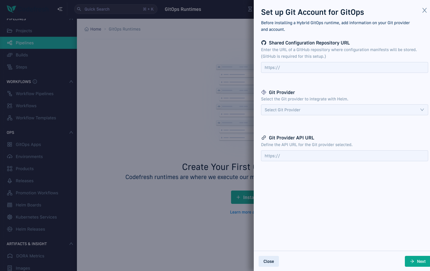
1 · No sense of progress — or end
Users reached what appeared to be the finish line — only to find more steps waiting. The flow had no visible structure: no step count, no progress bar, no defined end. It felt open-ended, which made users anxious and likely to drop off. The fix: a stepper that shows the entire flow up front, so its length is never a surprise.
Installation "done" — then three more required steps appear, unannounced.
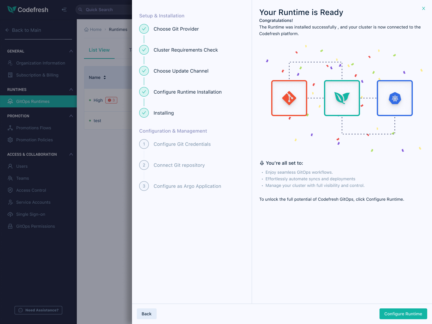
The stepper shows the whole journey from the start — including the three Configuration & Management steps still ahead, so "done" is never a surprise.
2 · Setup and execution were one blob
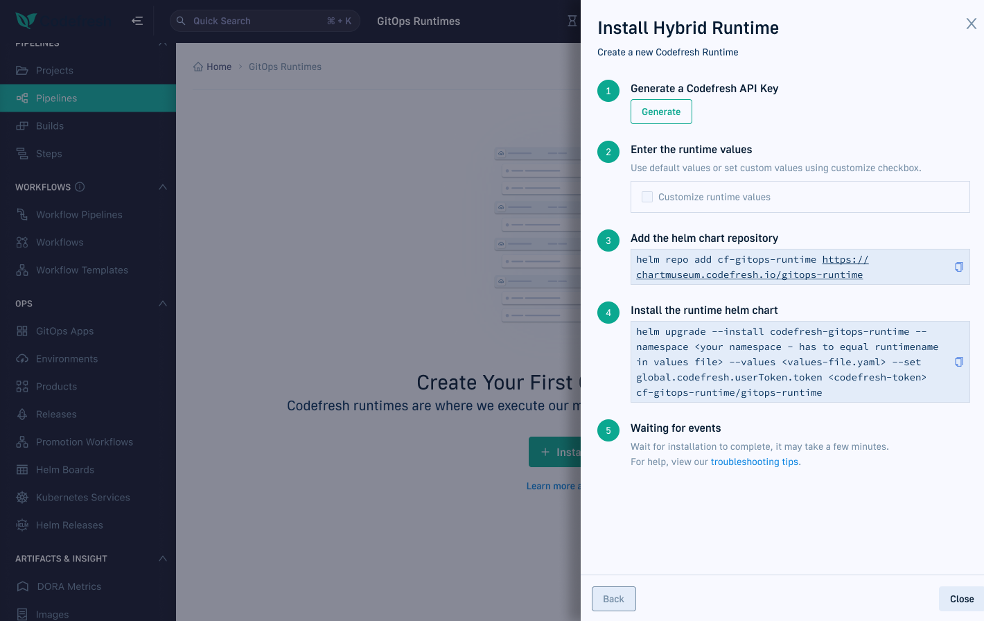
Form fields, token generation, and a terminal command all lived in one endless view — no sequence, no sense of progress. Users couldn't tell what to do first, how much was left, or where work in the UI ended and work in the terminal began, so many stalled or ran the command with incomplete config. The fix: Configure and Run became two distinct phases with a clear handoff between them — one job each.
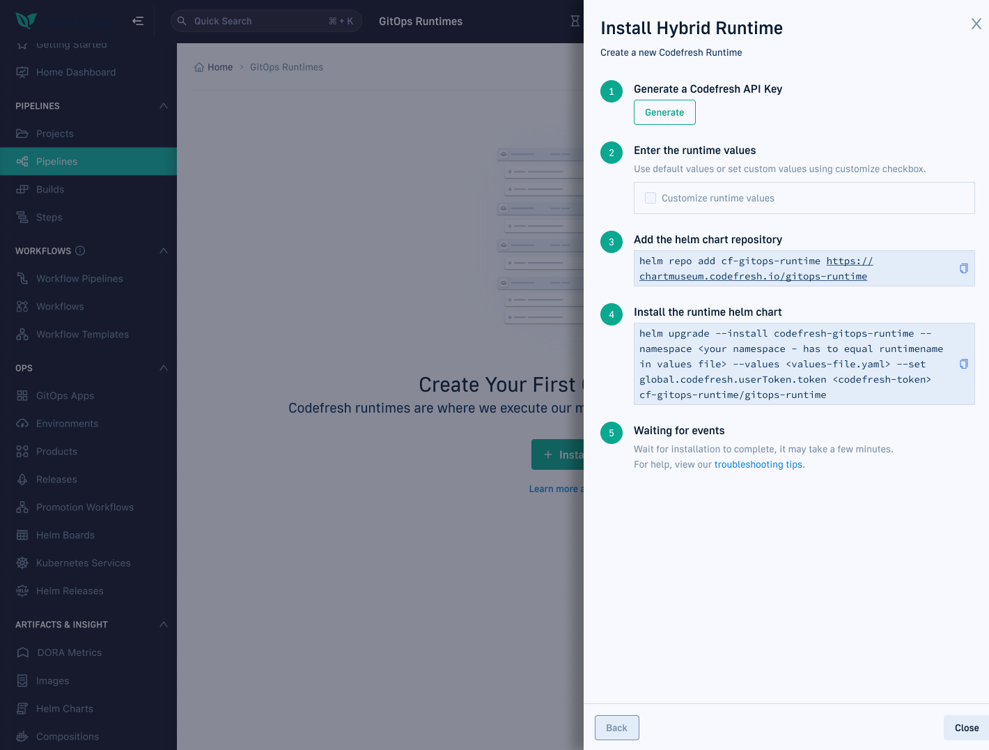
Everything at once: config, tokens, and the install command in one drawer — information overload with no clear starting point.
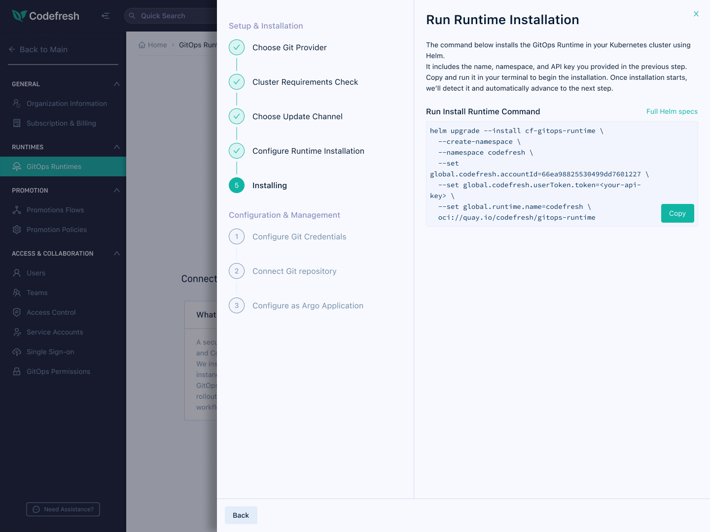
Configure in the UI, then Run in the terminal — two phases, one job each.
The old flow, annotated with what users actually said and felt at each step.

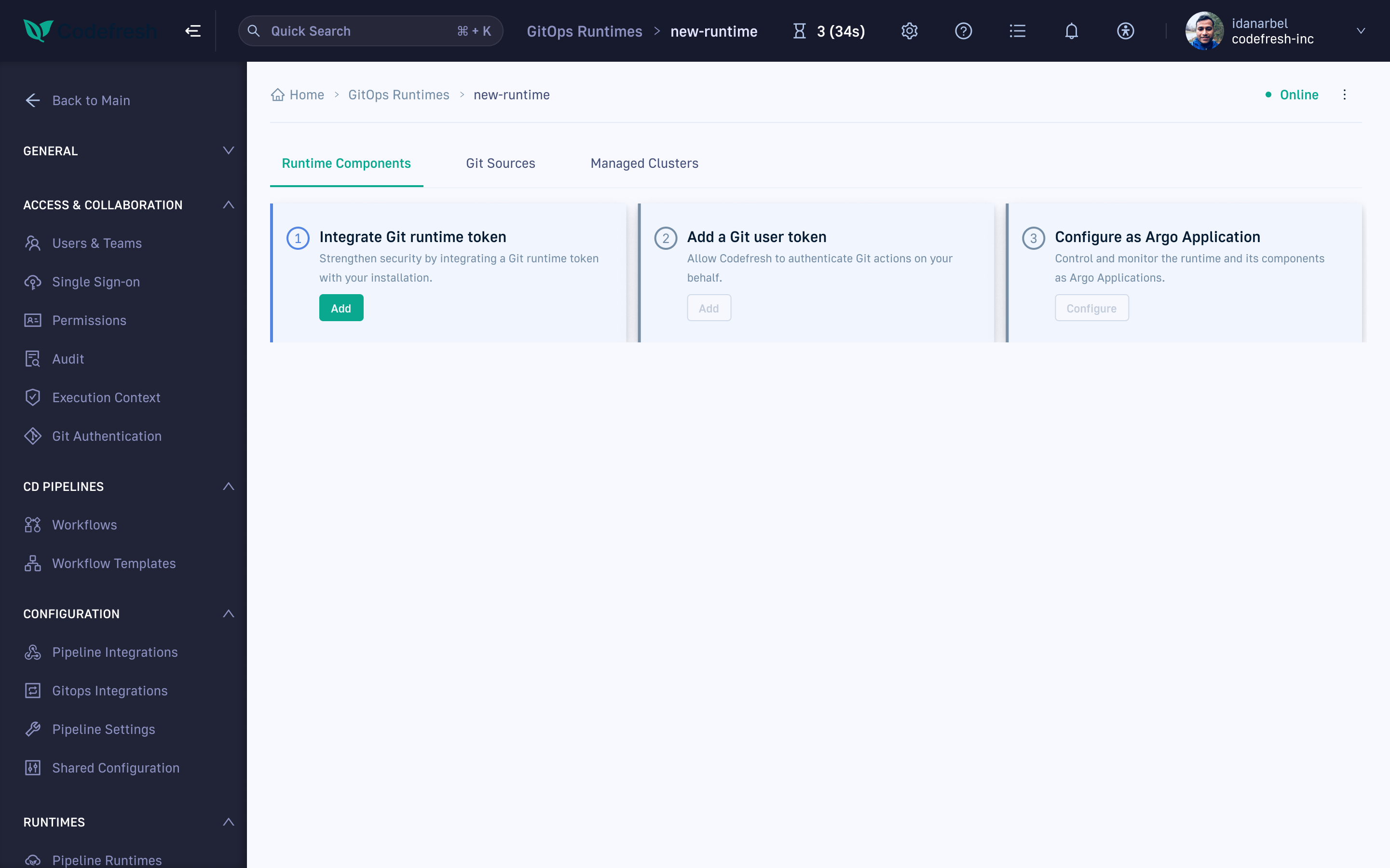
"Okay, I generated — where do I see it?"
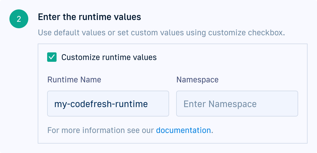
"Do I need to customize the runtime values? I check the box and suddenly there's more to fill in — an annoying surprise."
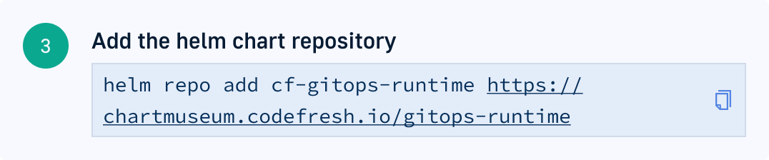
"Where do I add this? I see a copy button — where am I supposed to paste it?"
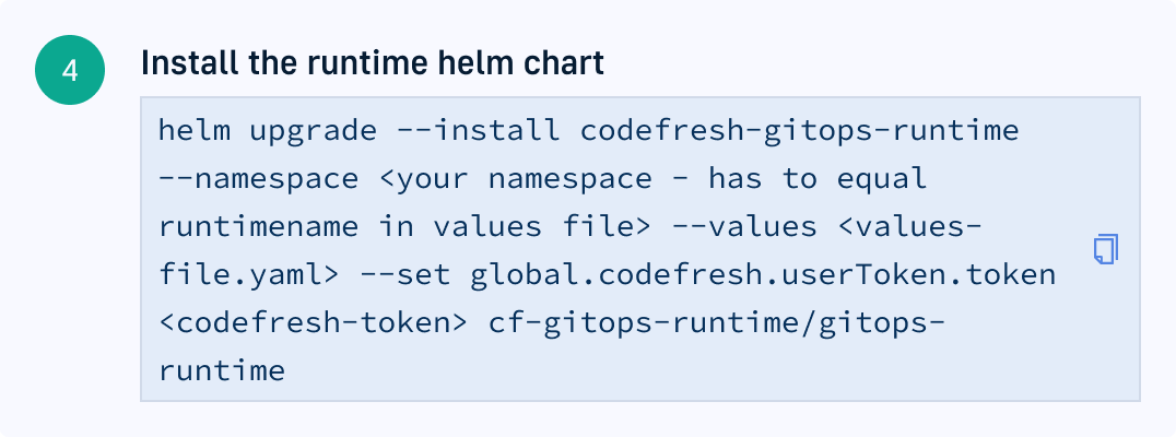
"Aha! This is the most important part. Finally." — and it's a wall of placeholders the user has to edit by hand.
The redesigned flow, annotated with the reasoning behind each decision.
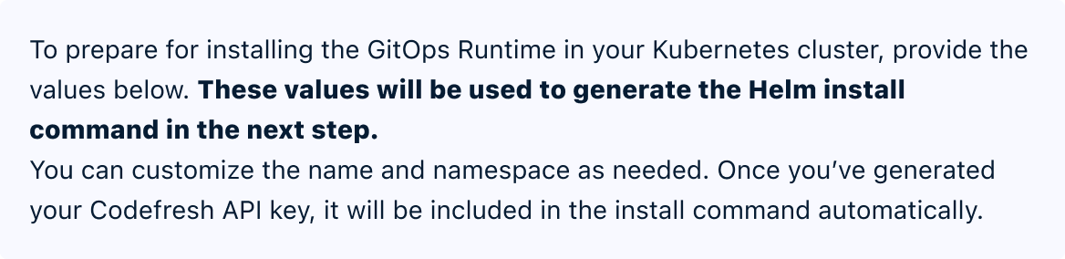
Instructions up front set the contract: what you enter here will generate the Helm install command in the next step.
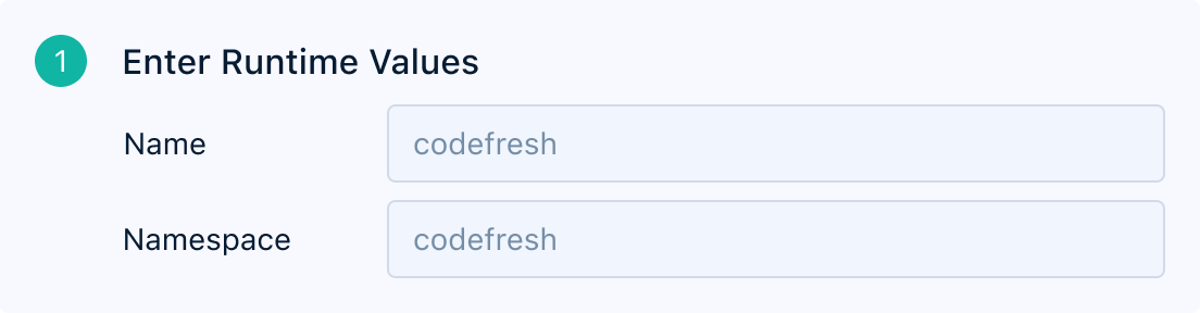
Fields come pre-populated with sensible defaults but stay visible and editable — no checkbox surprise.

The flow only advances once the API key is generated — the key lands in the command automatically, so there's nothing to lose track of.
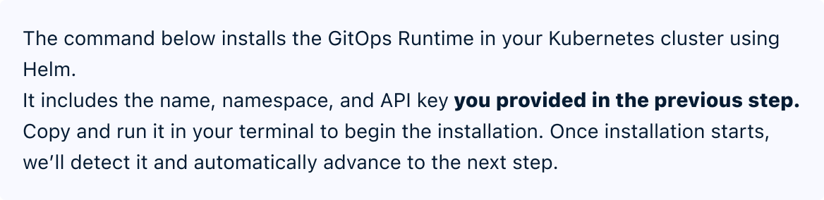
Before the command, a plain explanation: it already includes the name, namespace, and API key you provided.
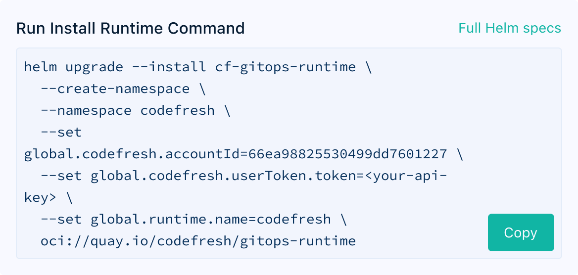
The Helm command is formatted for readability with one big call to action. Once it runs, Codefresh detects it and advances automatically.
3 · Silence after leaving the product
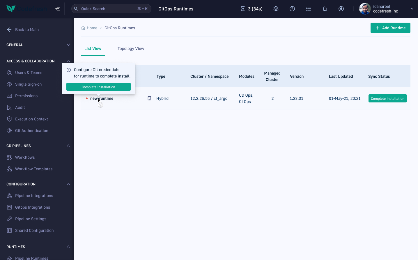
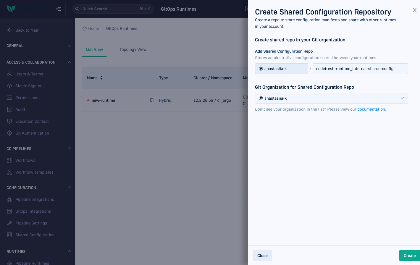
After running the Helm command in their terminal, users returned to Codefresh to find nothing had changed — no progress indicator, no confirmation the command had been received. That silence eroded trust in a moment when trust was everything. The fix: Codefresh detects the command starting and opens a live window into what's happening behind the scenes.
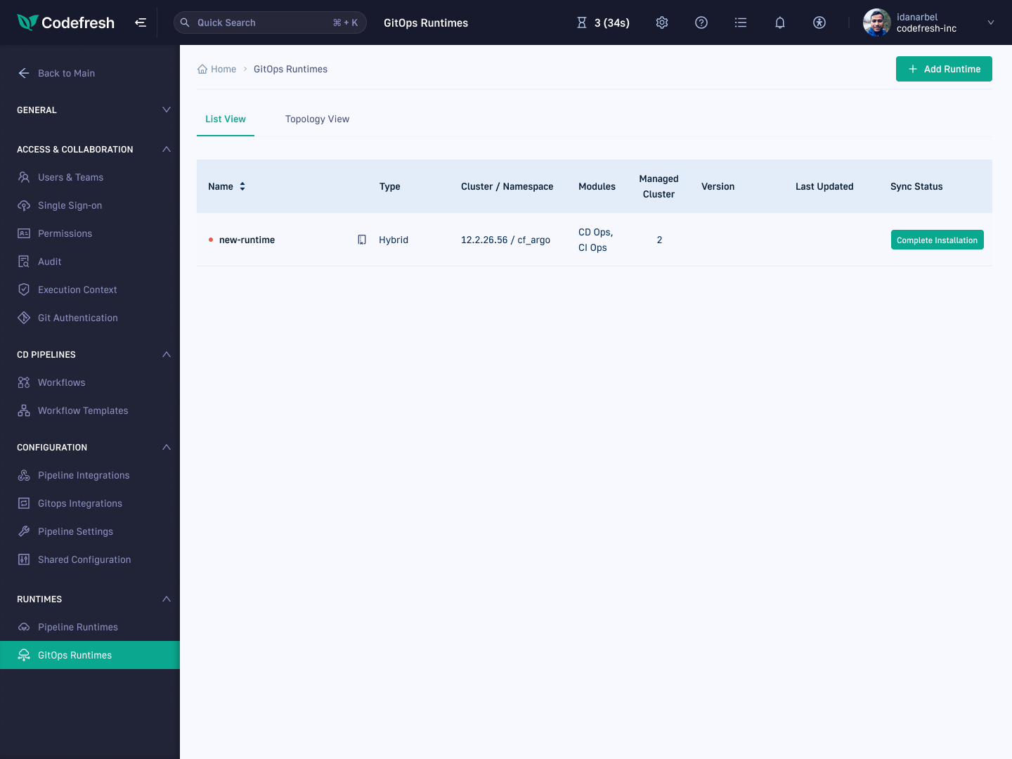
A table with initial runtime data - but nothing about what's actually happening.
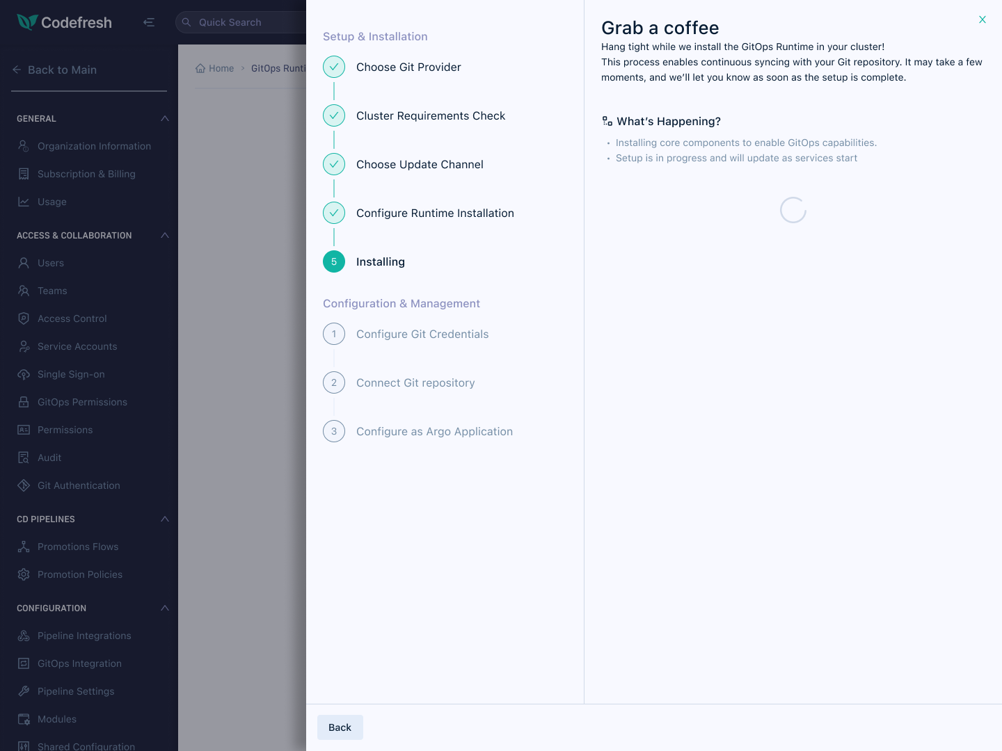
The moment Helm starts, the page advances itself — live progress, no refresh.
The design
6 decisions that shaped the redesign
Each of the following was a deliberate design decision with its own reasoning — from the structure of the stepper to what happens after the last step succeeds.
1. Designing the handoff moments
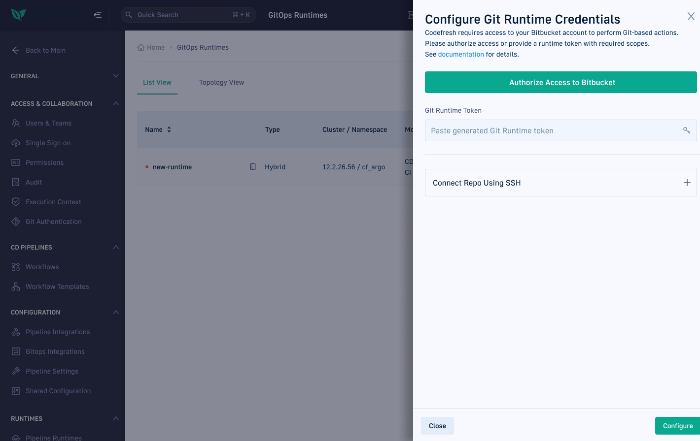
This isn't a flow that happens inside Codefresh — it happens across Codefresh, the terminal, and GitHub. The riskiest points in a multi-tool flow are the transitions — every time the user leaves Codefresh, there's a chance they don't come back. I designed each handoff to carry the user's context with them: the GitHub token step deep-links directly to the token-creation page with the right scopes pre-selected; the Helm command is generated with the user's name, namespace, and API key already baked in, so it's a single copy-paste rather than an exercise in template-editing.
The return trip is where the engineering partnership paid off. Because I was involved early, I learned the team could detect the Helm command starting — before that capability had a UI use. I designed the "Installing" state around it: the moment the command runs in the terminal, Codefresh advances itself and shows what's happening behind the scenes. The user never has to wonder whether it worked.
"When Helm starts running, Codefresh knows — and the page moves with you."
The Git credentials handoff: the deep link drops the user exactly where they need to be in GitHub, with the token settings pre-selected — generate, copy, and return.
2. The anatomy of the stepper
"The flow felt endless. I gave users a map."
The stepper isn't just a progress bar — its structure encodes the mental model. Steps are grouped into two named phases that mirror the tool boundary: Setup & Installation happens through Codefresh and the terminal; Configuration & Management happens after the Runtime is alive. The break between phases sits exactly where responsibility shifts — when the Helm command leaves the UI and enters the cluster.
This grouping also solved error attribution. When something failed, users previously couldn't tell whether the problem was a wrong config value, a failed command, or a cluster issue. With distinct steps, each failure has an address: it happened here, in this step, for this reason.
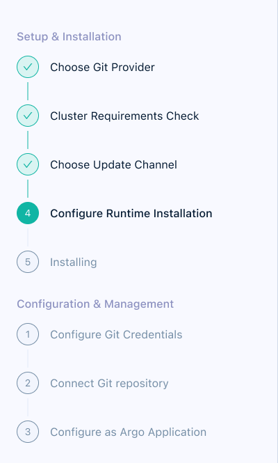
Two named phases, finite numbered steps — the whole journey visible at once.
3. Before we begin: prerequisites up front
Conversations with TAMs and Customer Success surfaced a recurring failure mode: users started the installation, got several steps in, and only then discovered they were missing something — cluster access, admin permissions, Helm, a GitHub account. Each discovery meant abandoning the flow mid-way and often not coming back.
So the flow now opens with a "Before you begin" checklist and a cluster-readiness verification — a single command users run to confirm their cluster is clean and ready, with a plain-language verdict either way. Everything gets gathered before step one, so nothing interrupts the flow once it starts.
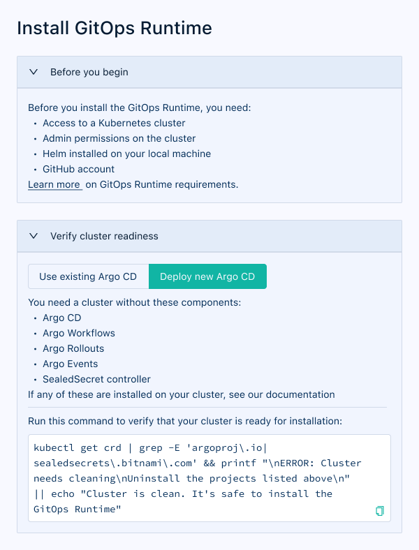
Requirements listed up front, plus a copy-paste command that verifies the cluster is ready.
4. Bring Your Own Argo: designing for teams that already have a setup
Discovery surfaced a blocker the original flow ignored entirely: many prospects already ran Argo CD in production. For them, "install a new Argo CD" wasn't a step — it was a dealbreaker that conflicted with their existing infrastructure. The redesigned flow makes this a first-class choice: Use existing Argo CD or Deploy new Argo CD, chosen up front, with each path getting its own tailored requirements, validation command, and configuration.
The two paths differ in real ways — the existing-Argo path needs an Argo CD Admin API token and a namespace check that the fresh-install path doesn't. Designing them as one branching flow rather than two products kept the stepper identical from the user's point of view: same steps, same finish line, different details inside.
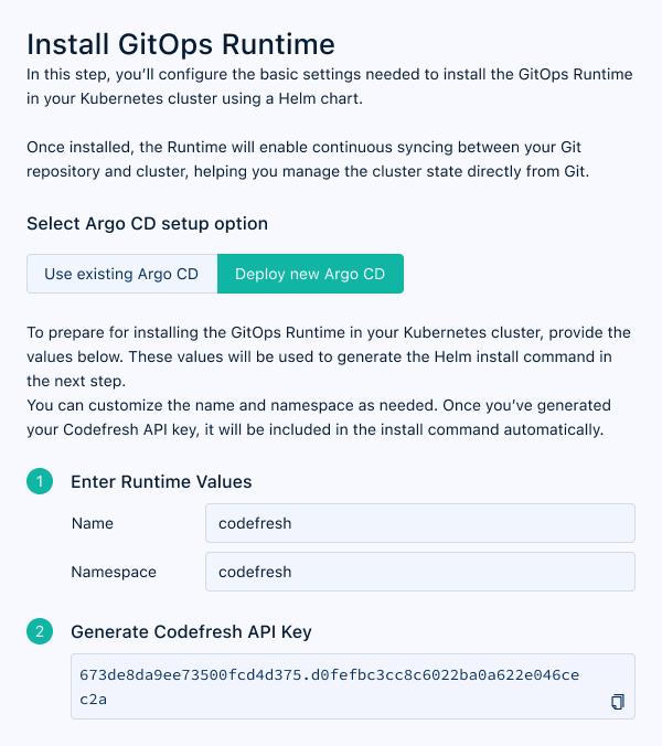
"Deploy new Argo CD": runtime values and an API key — the straightforward path.
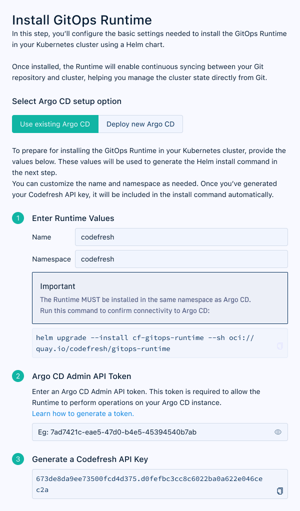
"Use existing Argo CD": the same step adds an Admin API token and a same-namespace constraint.
5. Post-installation: from "done" to "using Codefresh"
"Installation isn't the finish line. I built what comes next."
Installation success is a moment, not a destination — the user still hasn't deployed anything. I designed the post-install sequence as a continuation of the same stepper vocabulary: creating a first application, connecting clusters, and a one-click demo project. The key decision was sequencing over choice: instead of a dashboard of options, the user gets one recommended next action at a time, each building on the last.
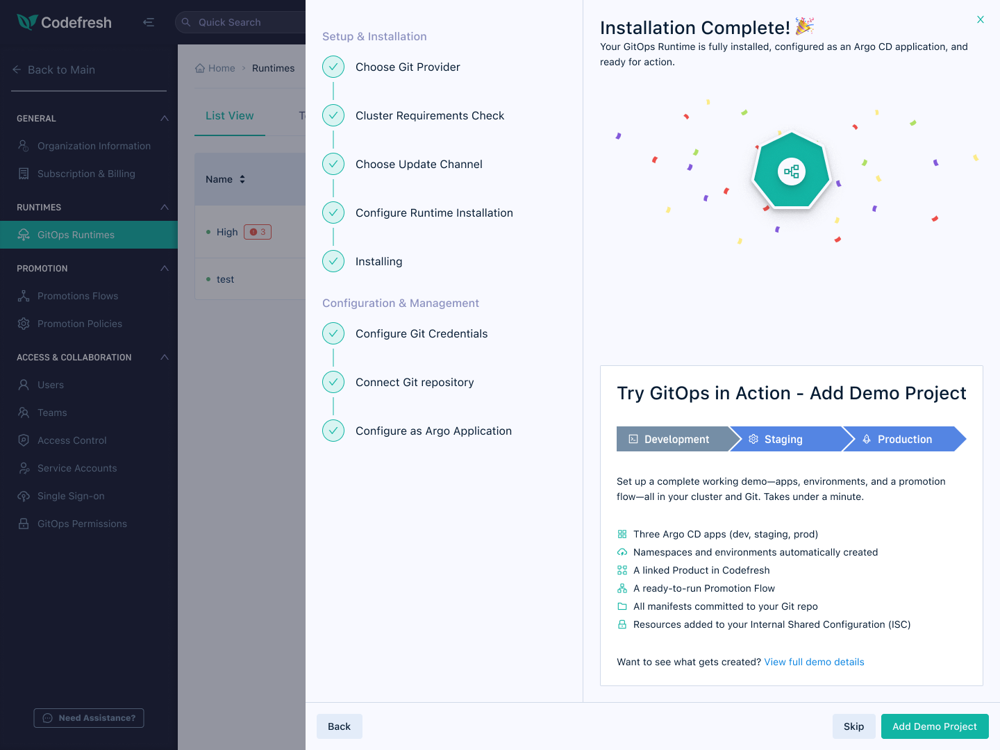
"Try GitOps in Action" — a one-click demo project that sets up apps, environments, and a promotion flow, so the first real deployment is minutes away, not days.
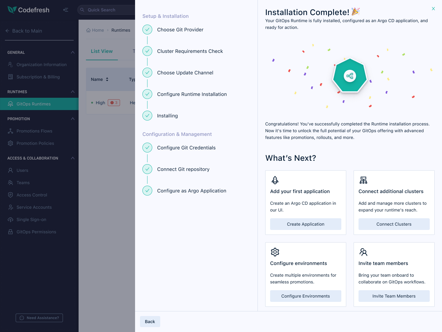
The sequenced "What's Next" flow bridges "installed" and "actually using Codefresh."
6. Git provider selection & the empty state
I also redesigned the first step — Git provider selection — and the empty state that users see before any Runtime is installed. Rather than a bare table, the empty state sets context: what the Runtime is, why it matters, and what the installation process involves. An embedded walkthrough video lets users arrive at the flow already oriented.
For unsupported Git providers, I replaced "Coming Soon" labels with an interest-tracking approach — avoiding implied timelines while generating real prioritisation signal for the product team.
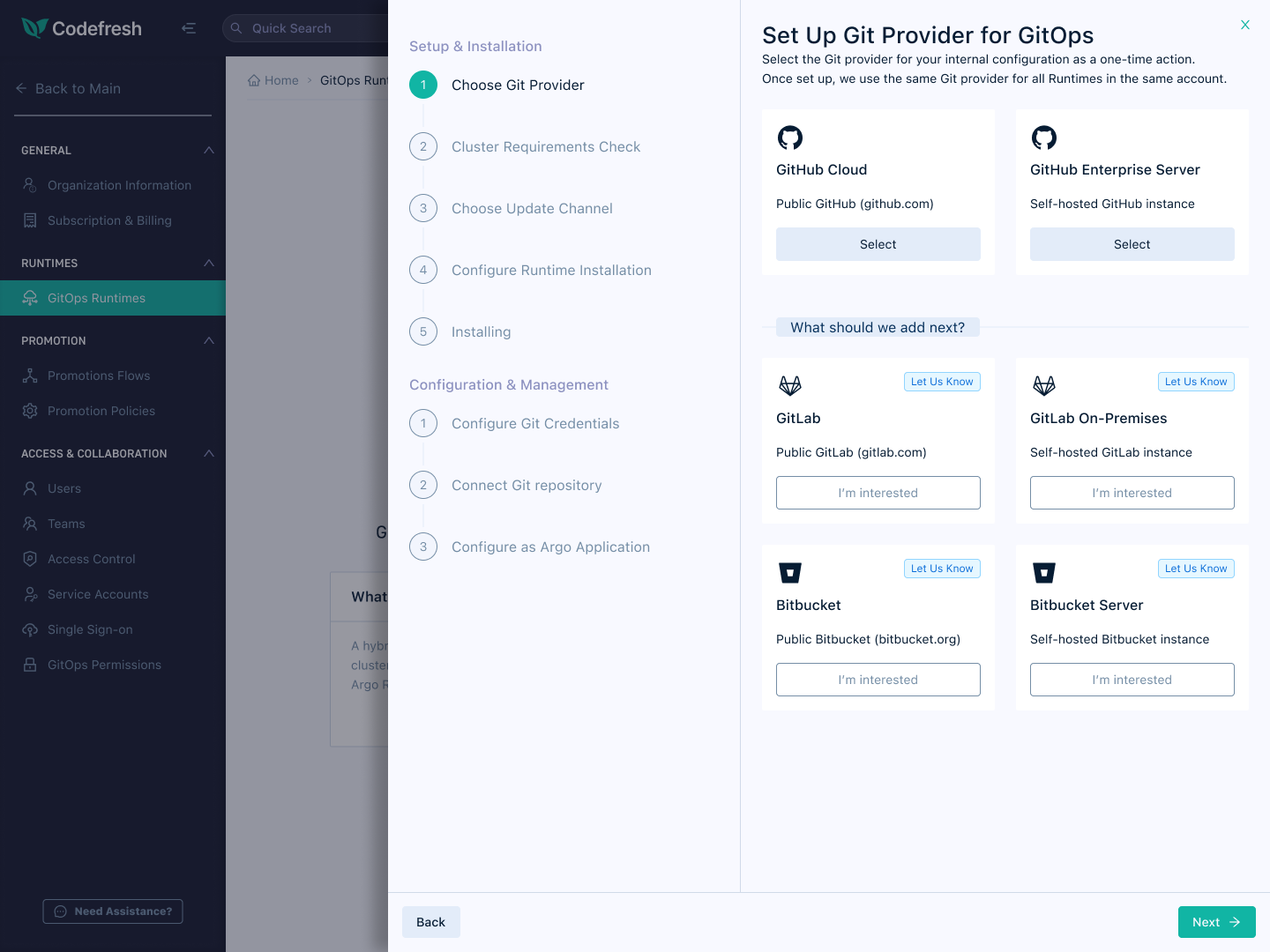
Provider selection: supported providers up top, "I'm interested" instead of "Coming Soon" below.
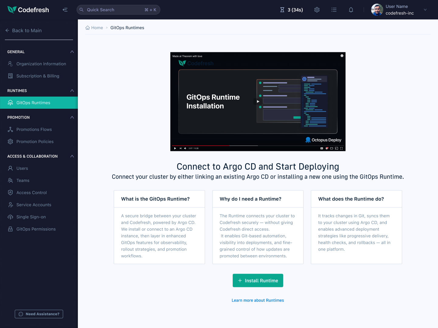
The redesigned empty state: walkthrough video, plain-language answers, one clear call to action.
Impact
Post-release results
+90%
Increase in GitOps Runtime installations
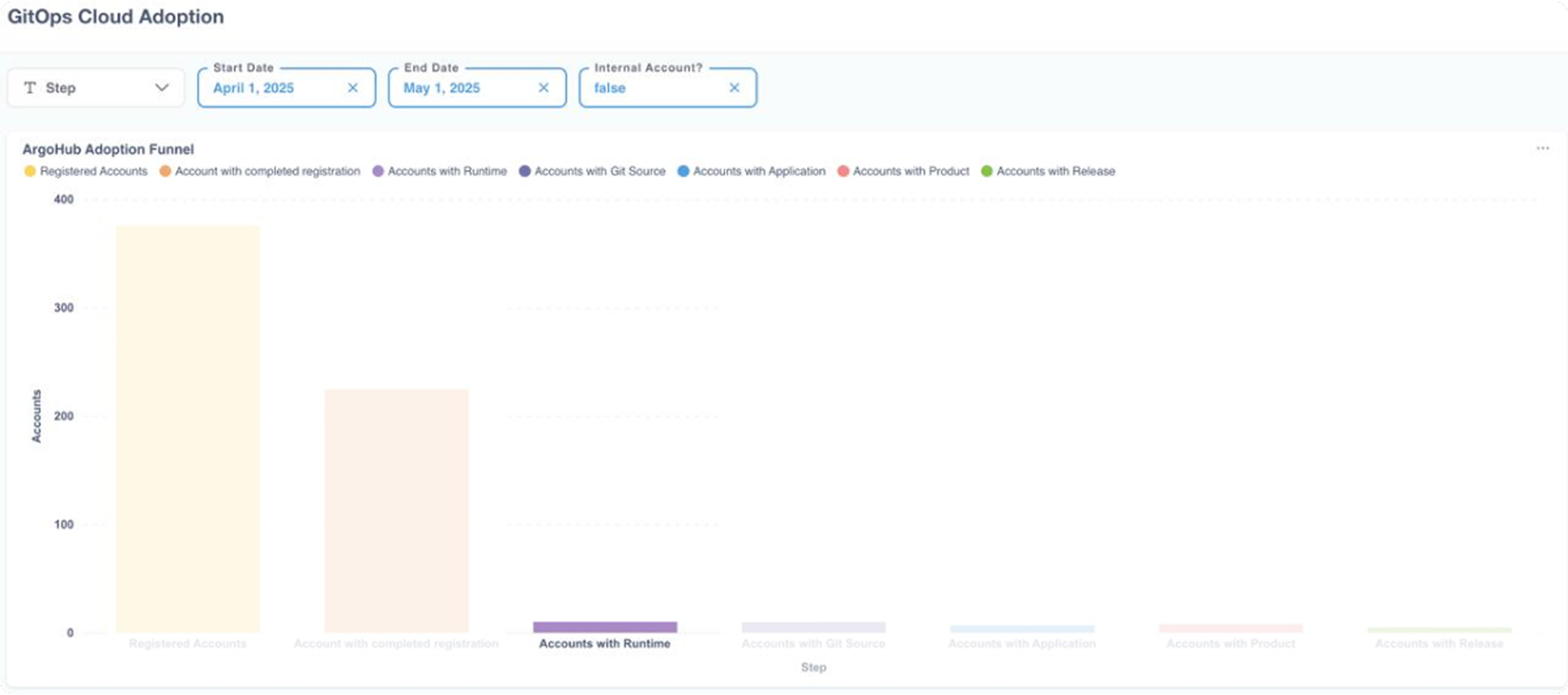
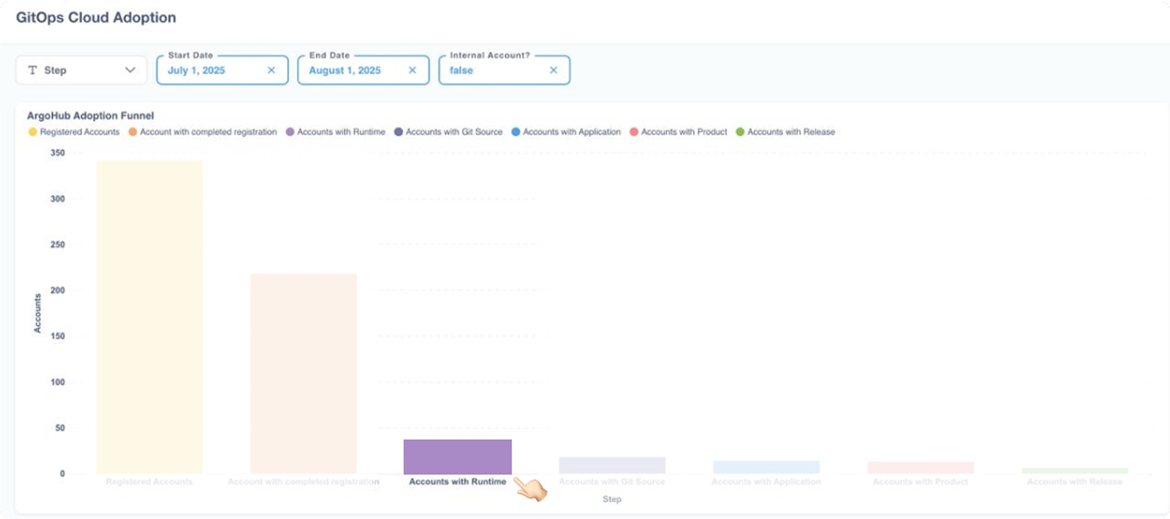
After shipping the redesigned Runtime flow, installations increased by 90%. The gain came from the combined work: a clearer UX, better error handling, removing unnecessary steps, and eliminating technical roadblocks — chief among them the requirement to install our Argo CD fork, which Bring Your Own Argo removed for teams with an established GitOps setup.
No single change explains the number — it was the accumulation of removed friction across the whole flow.
Measurement bookended the project: the same analytics that exposed drop-off before design became the baseline for ongoing post-launch analysis — and improvements like BYOA came directly out of that loop, not the original spec.
Before Bring Your Own Argo
After Bring Your Own Argo
Reflection
What this project taught me
This was one of the more technically demanding projects I've worked on. Understanding the Runtime well enough to design for it meant going beyond interface patterns — I needed to understand Kubernetes, Helm, and Argo CD at a level where I could anticipate where users would get confused.
The most important lesson wasn't about simplifying complexity. Platform engineers know what a terminal is. What they struggled with was knowing which tool was responsible for which action, and what to do when something went wrong. The design challenge was navigation, not explanation.
Collaborating closely with engineering was essential. The split-phase installation design only became possible because I was involved early enough to learn about the Helm detection signal before it shipped. If I had designed purely around the existing architecture, the biggest UX improvement in the project would never have happened.
"The challenge wasn't hiding complexity from users — it was helping them understand where they were in a multi-tool workflow."