A purchase experience built for developers - and the design system behind it.
+40%growth in paying customers
CompanyCodefresh by Octopus Deploy
RoleSenior Product Designer
FocusUI · Typography · Icons
Year2024
Outcome+40% growth in paying customers
From contact form to self-serve
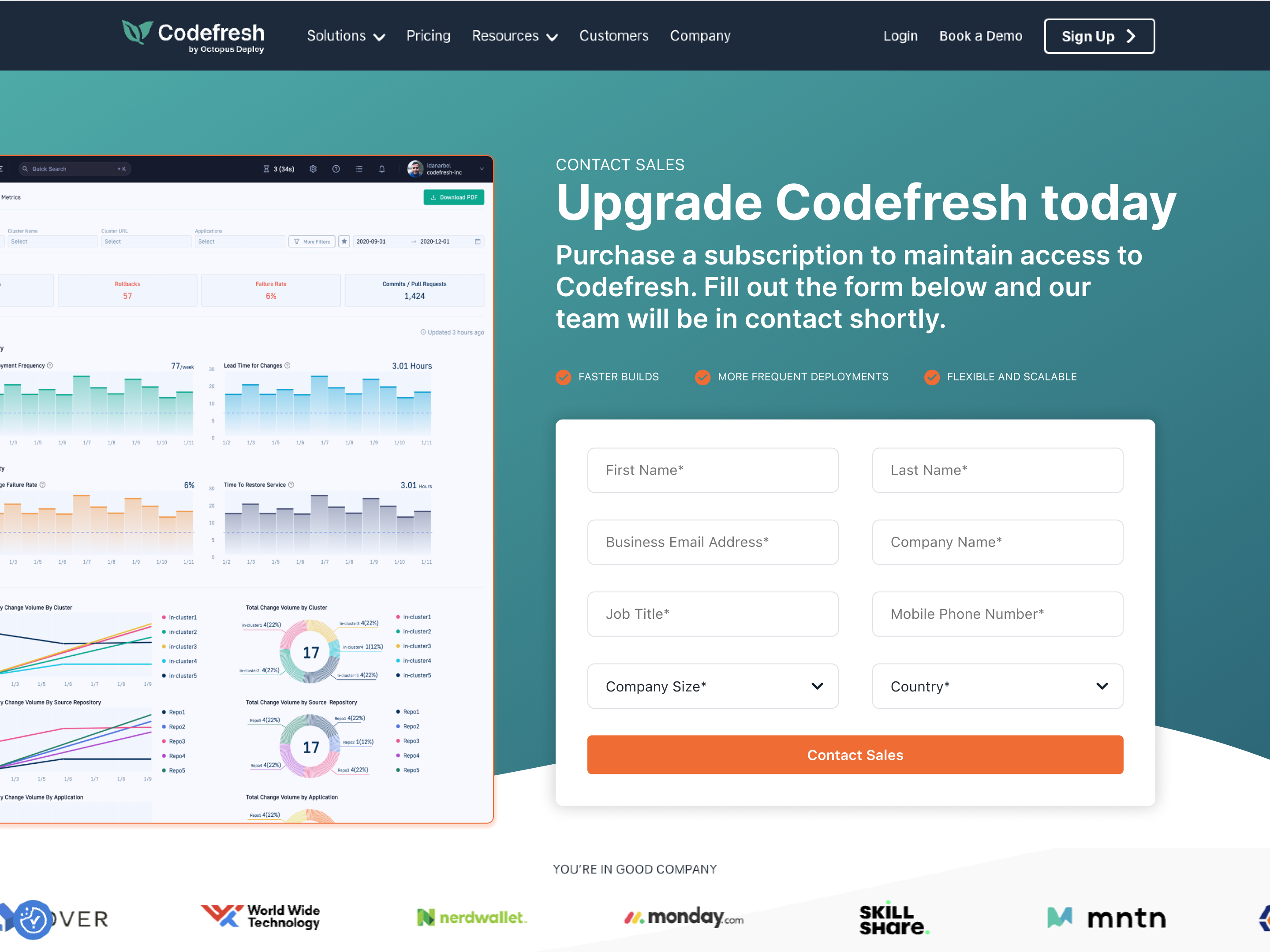
Codefresh was entirely sales-led. To buy a subscription, you filled out a form and waited. There was no pricing page, no in-app checkout, no way to complete a transaction without talking to someone.
When Codefresh shifted toward product-led growth, the trigger moment became clear: a user's free trial ends. They know what they need - and at that exact moment, we were asking them to call sales. That flow needed to change, and it needed to live inside the product.
The original upgrade path - a contact form on a marketing page.
Phase 1 - A self-serve baseline
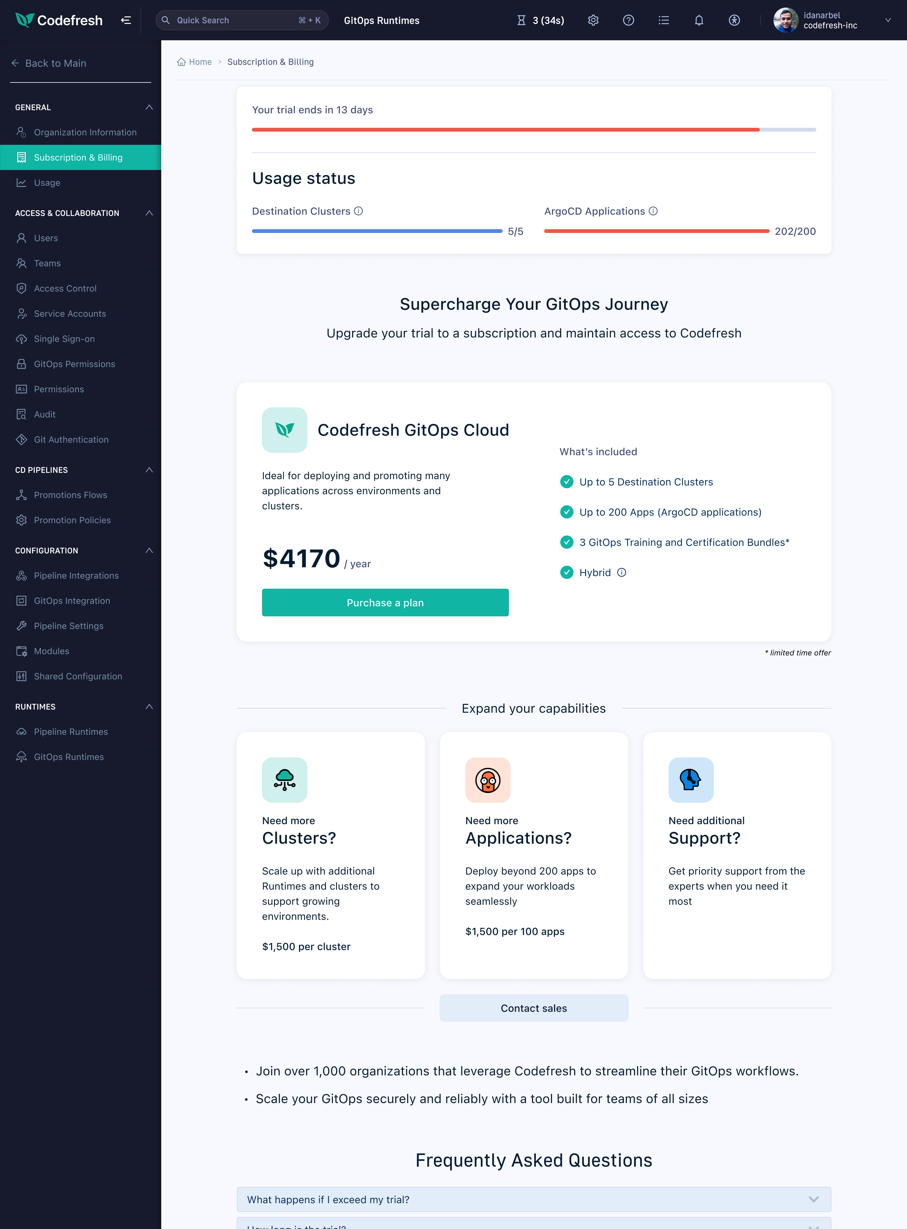
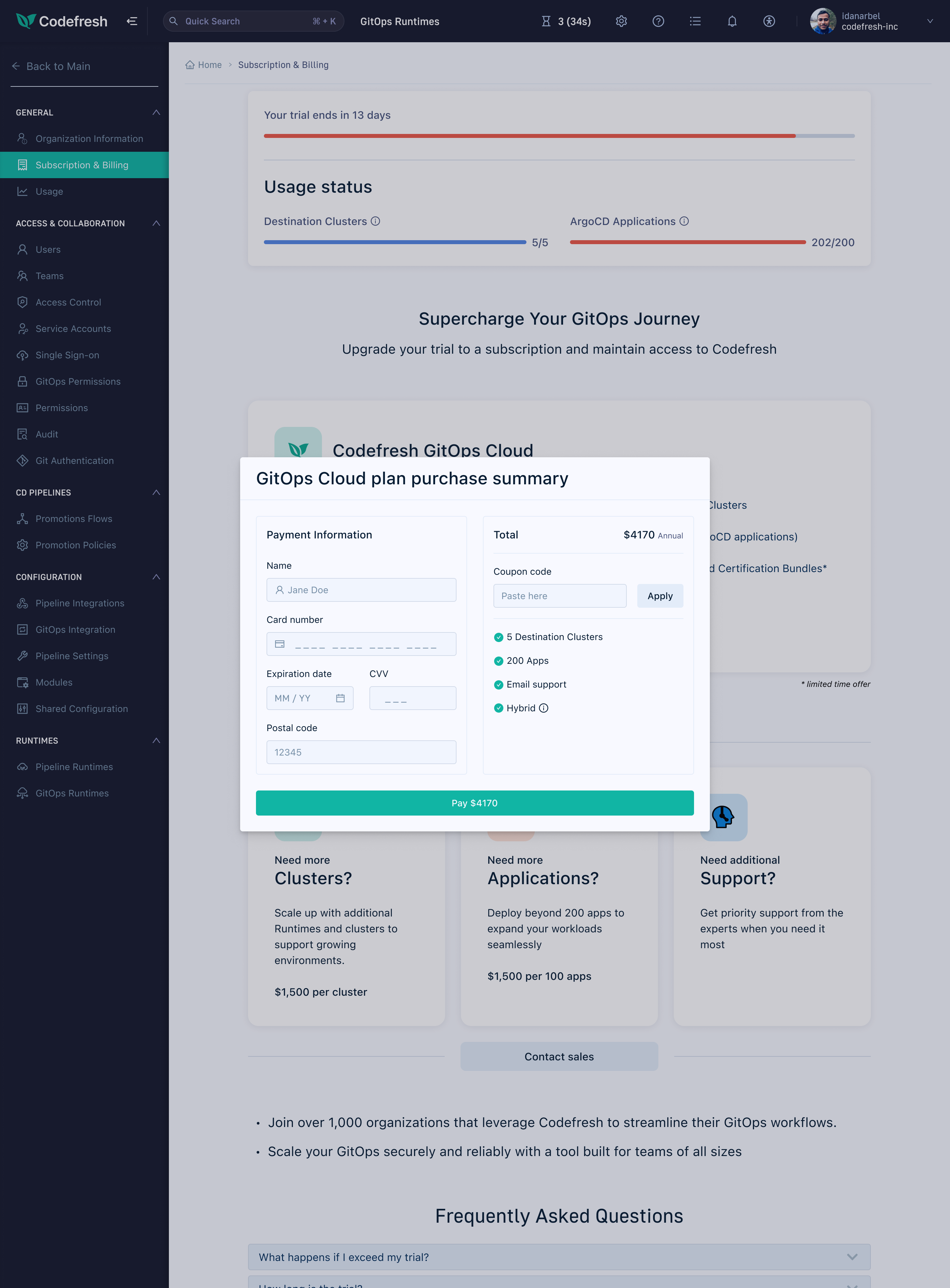
The first version brought the purchase flow entirely in-app. A fixed plan card showed what was included at $4,170/year, with usage meters at the top showing exactly how much of the trial had been consumed. Clicking "Purchase a plan" opened an inline checkout modal - the first time a Codefresh user could go from trial to paid without sales involvement.
Subscription page - trial usage and plan details.
Inline checkout - payment form with support tier selection.
Phase 2 - Right-size your plan
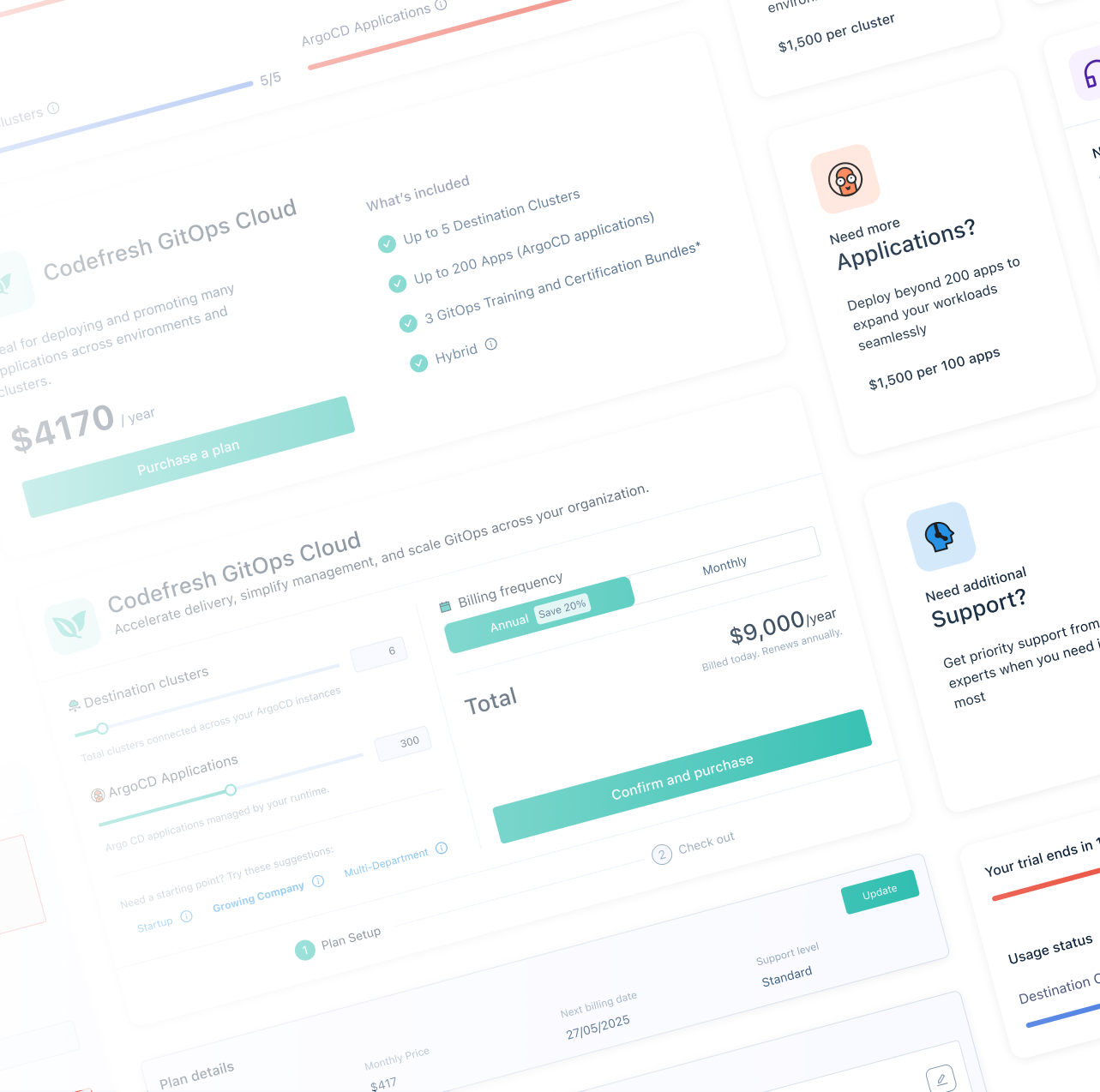
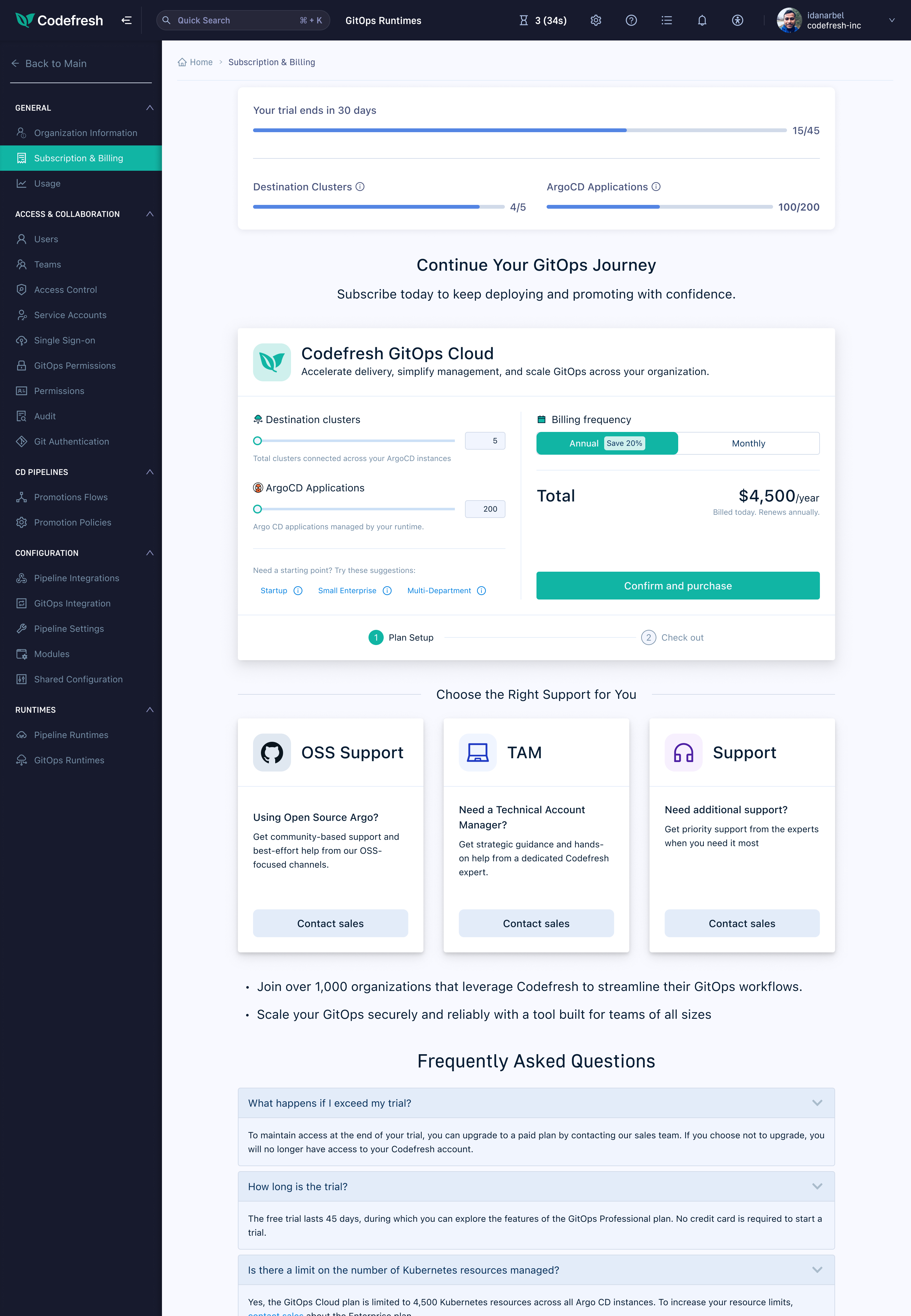
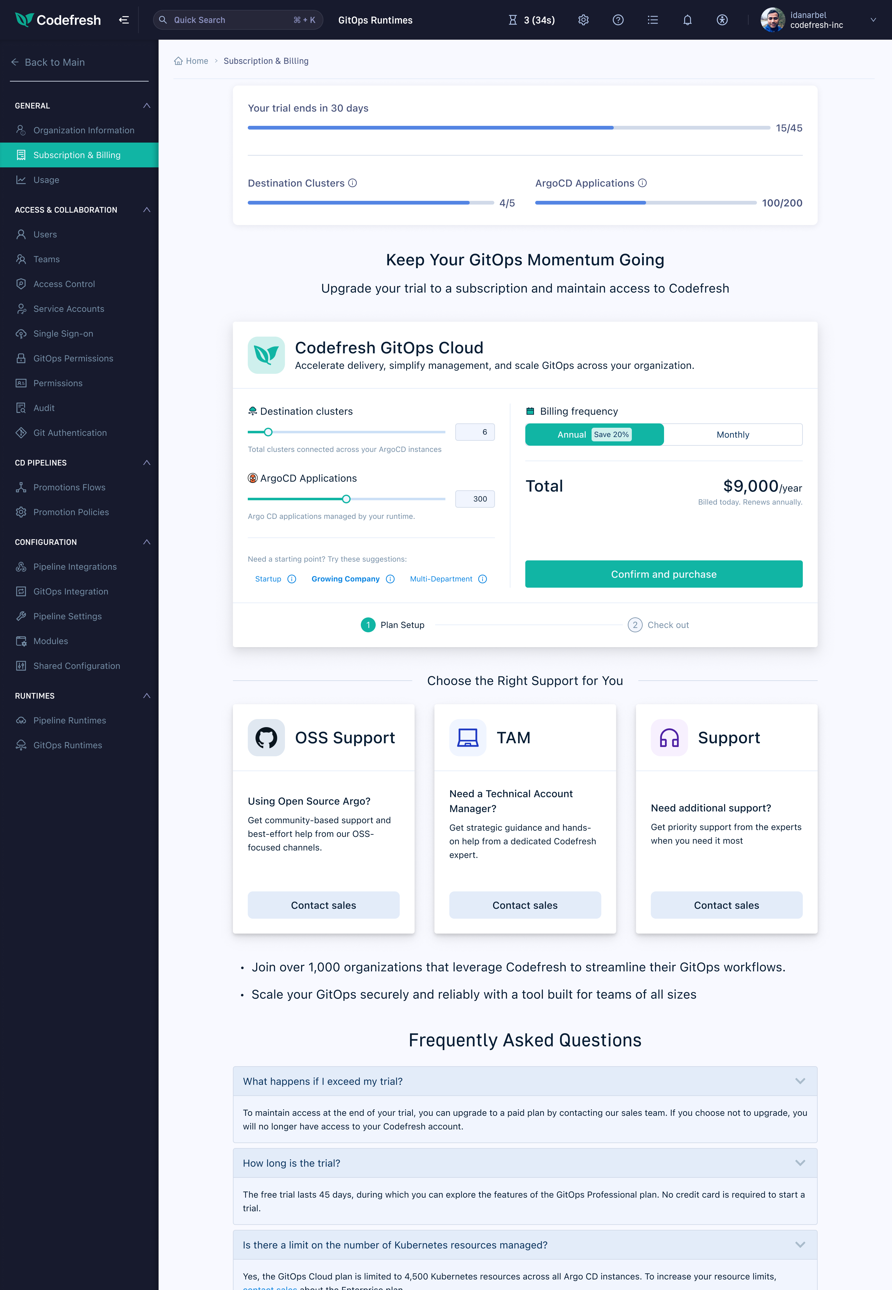
The second phase replaced the fixed plan with a live configurator. Two sliders - destination clusters and ArgoCD applications - let users build their own plan, with the total updating in real time. Preset bundles (Startup, Growing Company, Multi-Department) gave users a starting point without locking them in. An annual/monthly toggle made the 20% discount tangible rather than buried in small print.
This shifted the frame from "choose a tier" to "build your plan." A small UI change with a measurable effect on how users engage with the price before committing.
Configurator - sliders, presets, and a live total.
Configurator - alternate plan state.
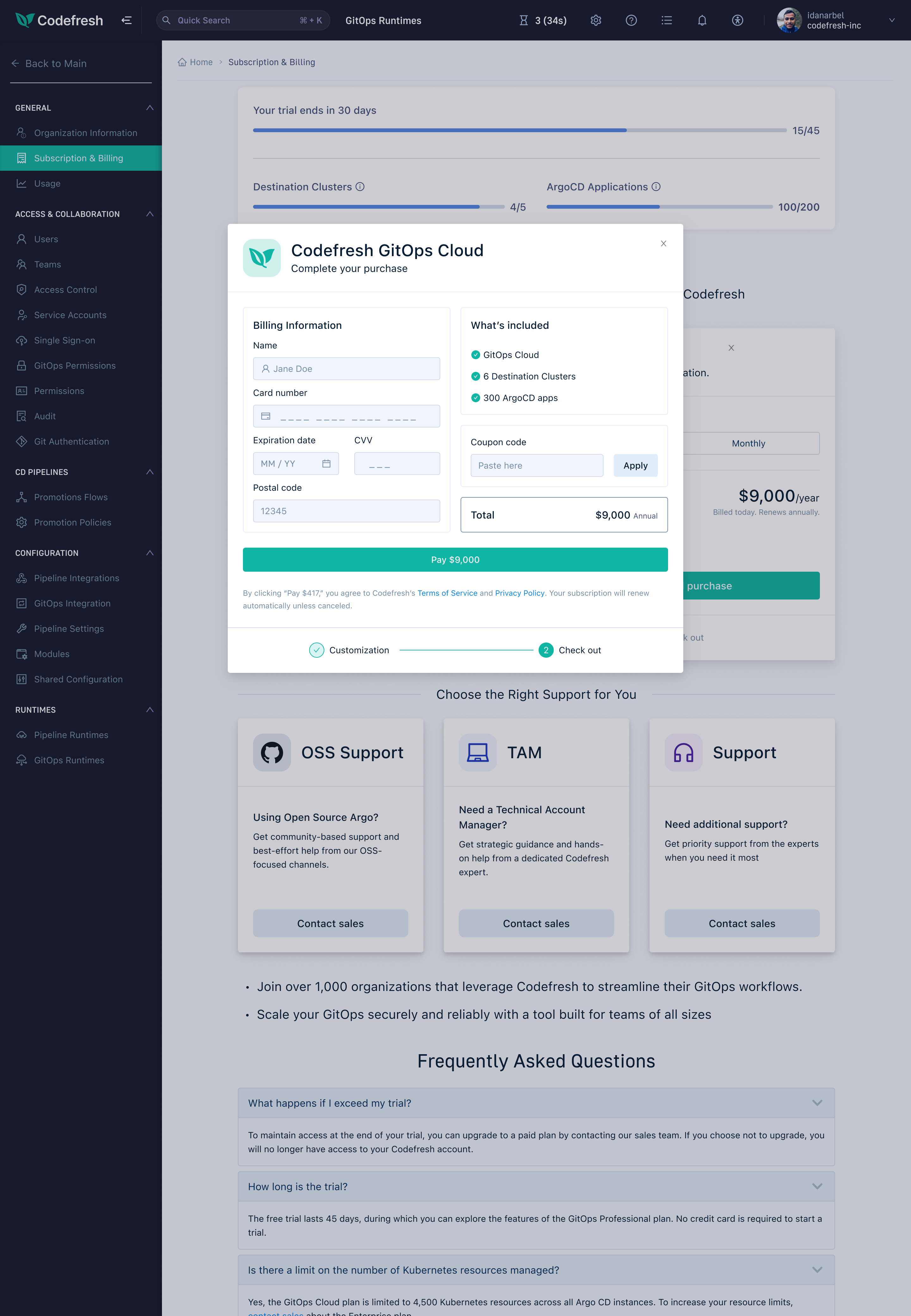
Checkout - payment details with order summary.
Configuring a plan - sliders, presets, and a live total updating in real time.
The Design System
Colour
Six colours. Teal as the primary action colour - every CTA, every interactive control. Two blues for the product shell: near-black for the deepest chrome, mid-blue for the sidebar. Three steps of light - silver, sky, and near-white - for backgrounds, borders, and elevation.
The palette was chosen to feel native to a developer tool: precise, restrained, and purposeful.
Teal · Navy · Blue · Silver · Sky · White - six colours, each with a clear role.
Typography & icons
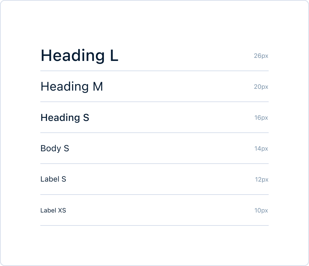
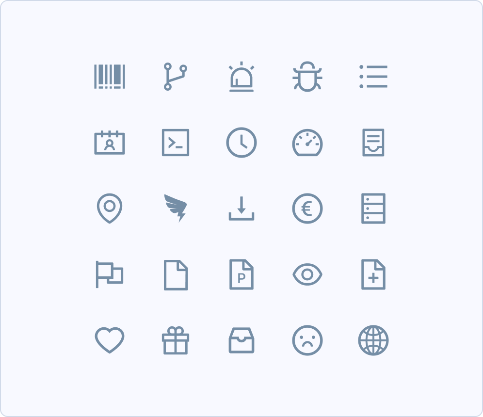
A six-step type scale from Heading L (26px) down to Label XS (10px), paired with a set of 25 line icons built for the platform. Both were designed to recede in dense UI - consistent weight, clear silhouettes, no visual noise.
Colour tokens
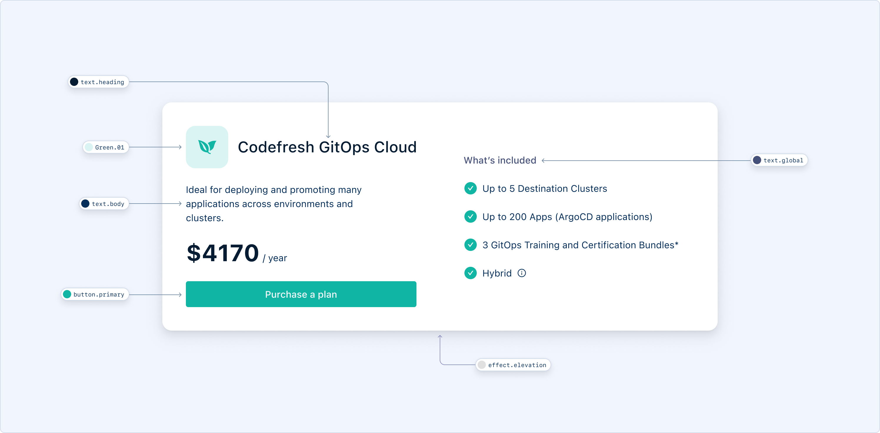
Every colour in the system is a named token - applied consistently across components rather than hardcoded per element. Switching context (light → dark, neutral → error) is a token swap, not a redesign.
Semantic tokens - each colour defined by its role, not its value.
Components
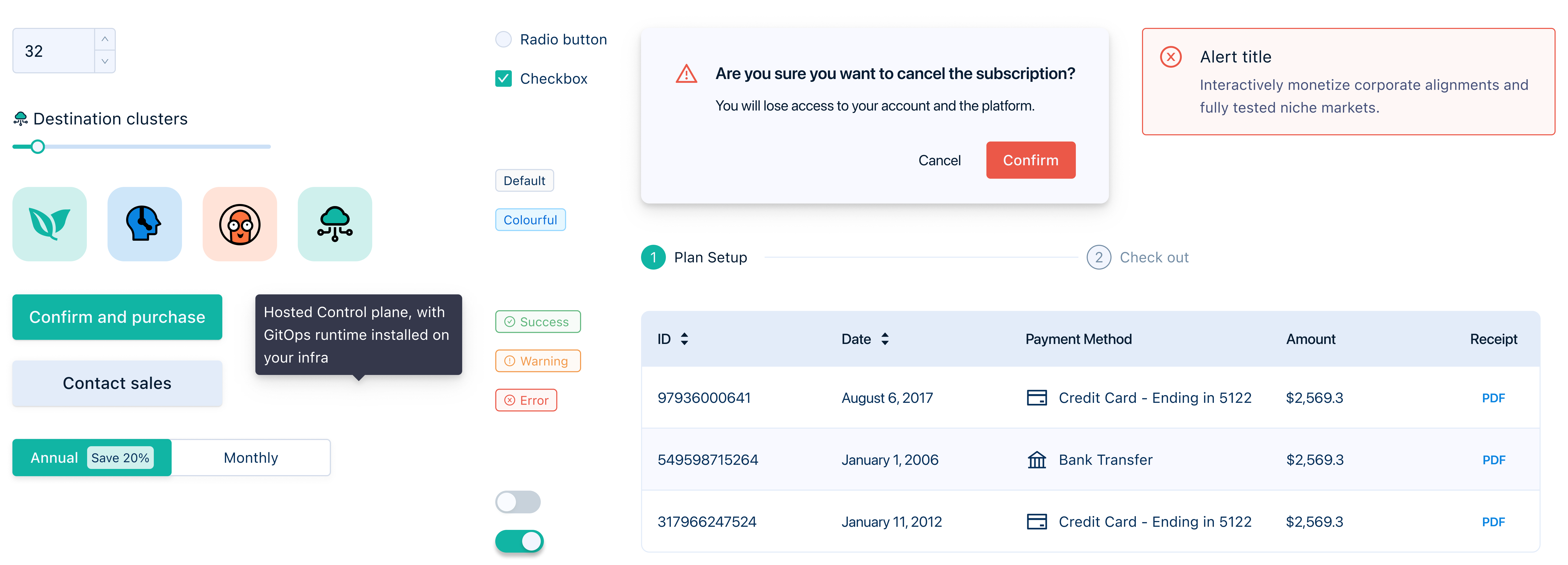
Every interactive element in the purchase flow was designed as a reusable component: illustrated icon cards, sliders, billing toggles, primary and secondary buttons, radio buttons, checkboxes, status tags, toggle switches, data tables, tooltip popovers, and destructive confirmation dialogs. Each component was tested across both light and dark contexts before shipping.
A selection of components from the subscription and billing experience.
Light & dark
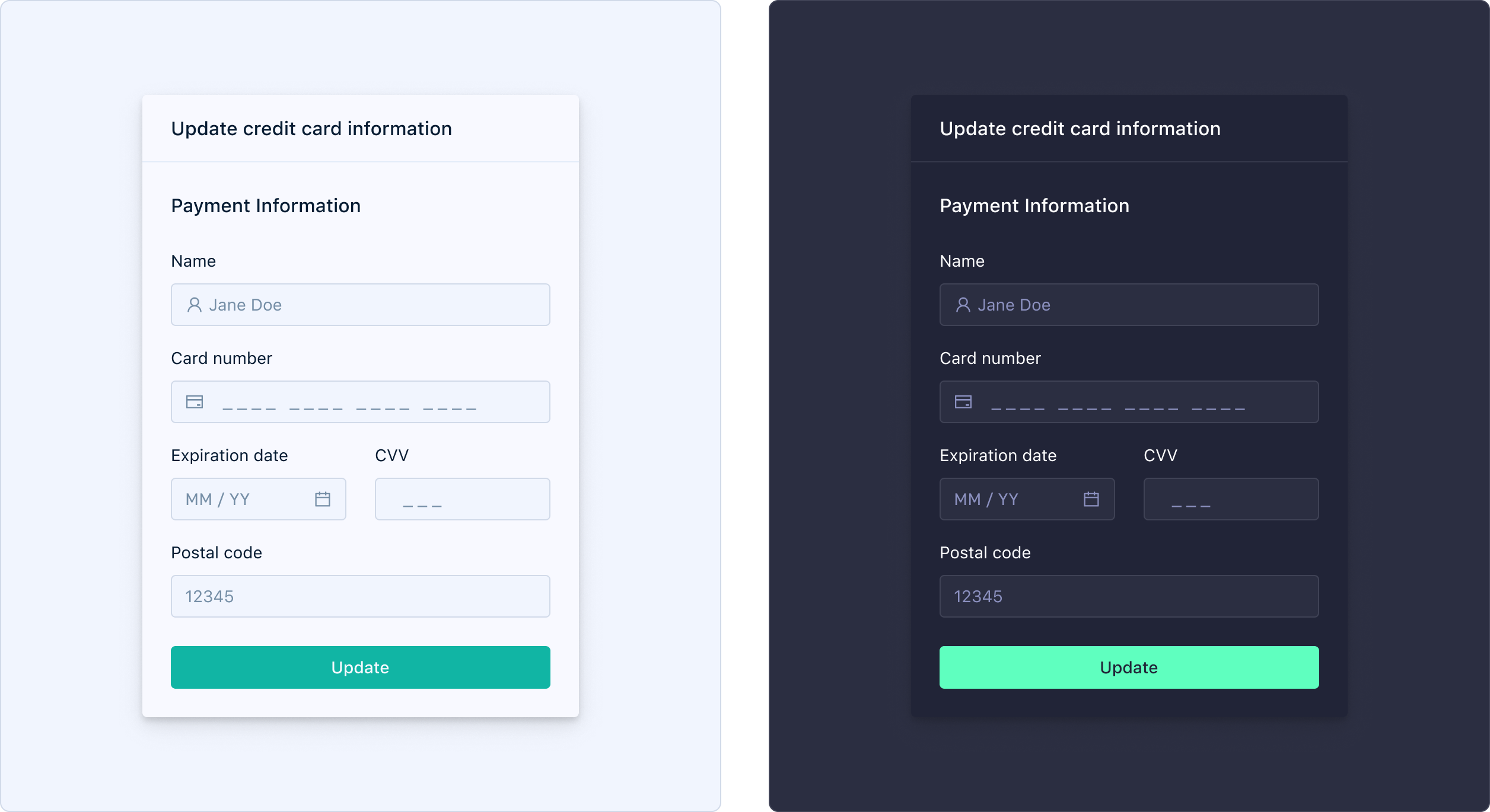
The product shell is dark - deep navy sidebar, high-contrast chrome. The purchase experience needed to work cleanly in both contexts: a white card surrounded by dark chrome, and the same components adapted for an entirely dark surface.
The same component in light and dark - consistent contrast, consistent hierarchy.
Outcome
The self-service checkout was Codefresh's first end-to-end purchase flow without sales involvement. Both phases were planned from the start and shipped gradually - validate the checkout before adding pricing complexity. Within six months of launching Phase 2, paying customers grew by 40%.
+40%
growth in paying customers within six months of launch
First
self-serve checkout in Codefresh's history
2
phases planned from day one, shipped incrementally