
About the project
Making CVE data more accessible and actionable
This project revolves around enhancing Prisma Cloud's method of presenting CVEs, aiming to provide users with a more comprehensive and actionable view of security vulnerabilities. As part of the Prisma Cloud team, I played a pivotal role in reimagining how CVEs are communicated to ensure a more effective and user-friendly experience.
The Goal
This endeavor aimed to tackle the complex challenge of making CVE data more accessible by striking the right balance between technical intricacies and user-friendly design. By simplifying complex data and prioritizing usability, it empowered users to effectively secure their systems, contributing to enhanced cybersecurity practices.
What Is a CVE?
"Common Vulnerabilities and Exposures" is a way to identify and catalog known security issues or weaknesses in software. It's like a universal language that helps people talk about and understand problems with computer programs and devices.
Each CVE has a unique identifier number, and when a vulnerability is discovered, it gets assigned a CVE number so that everyone can refer to it in the same way. This helps security professionals, software developers, and users all over the world work together to fix these problems.
The Team
- Alon — PM
- Hari — Director, PM
- Eytan — Manager UX
- Sharon — Manager Research
- Yours truly
My Role
As the Product Designer for this project, my responsibilities included conducting user research, collaborating with the assigned product manager, designing user interfaces, and testing prototypes to refine the CVE presentation approach.
Users
Two very different people, one shared problem
The challenge centred around two distinct user types, each approaching CVEs from a different angle.

"I want to make sure that I have visibility in all aspects of the cloud environment and ensure they are secured."
- Manage the discovery of assets
- Monitor, investigate and remediate alerts
- Manage risks & vulnerabilities
- Generate security reports
- Has a lot to deal with: onboarding, policy controls, notifying DevOps and more
- Needs help prioritising what to deal with first

"Just tell me what I need to fix so that I can get on with my life."
- Manage & respond to alerts
- Implement preventive measures throughout the pipeline
- Communicate with dev teams to fix issues
- Hard to understand the full scope and impact of a vulnerability
- Hard to identify affected assets
- Missing clear actions — what to patch, open PR, etc.
The challenge
Merging two use cases into one
The main challenge I tackled involved merging two use cases into a single platform capable of presenting data in a user-friendly manner. The 2 use cases are:
- Investigating if I'm affected by a specific CVE
- Responding to a CVE that was found in my environment
Each use case matched a different user (Vanessa & Ricardo) and we debated within the team whether we should combine them into a single view or have two separate views.
Vanessa — Investigating
Check if I'm affected by a specific CVE:
- How "bad" is this CVE? — provide knowledge-base details in Prisma Cloud rather than send the user to NVD
- Was this CVE found in my environment?
- Yes — which of my resources are impacted? Prioritise the assets/packages with highest CVSS + patchable for mitigation
- No — what packages (globally) are affected? Use the CVE sidecar as a general knowledge base
Ricardo — Responding
CVE that was found in my environment:
- How "bad" is this CVE?
- How widespread is this CVE in my cloud estate? What assets & packages are impacted?
- What should I do about it? — Highlight actionable parts: is it exploitable? patchable? Take remediation actions — open PR, assign a ticket, apply virtual patch, ignore, suppress…
Product initiative and our response
Product's initial suggestion was to have a separate sidecar for each use case. As the user's representative I strongly advocated against that.
I based my argument by conducting user research. We talked to 3 separate users who all use Prisma Cloud for vulnerability management. We presented the users with a separate option and a unified one and asked them what made more sense to them.
The key takeaway from these sessions was information architecture. Our users expected to find all the information regarding a CVE under the CVE's name — not to have to go to 2 separate pages to find the CVE's information.
Design process
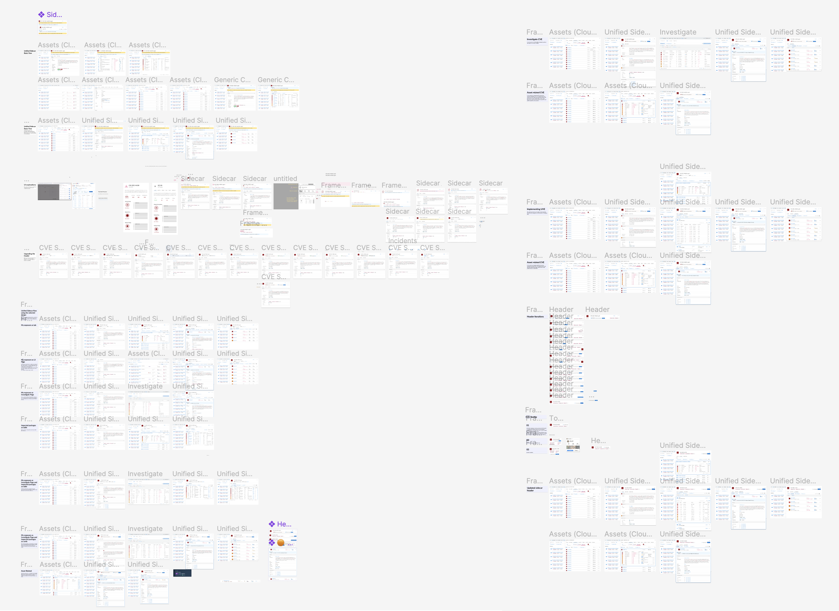
Three approaches before we got it right
Separate sidecars per use case
My initial thought was to separate the use cases — each flow would have its own sidecar. The idea: a general CVE sidecar with general information, and within an asset sidecar, a CVE breakdown per asset. There would be an option to "jump" from one to the other.
.png)
We decided to discard this idea because sometimes the use cases overlap, and having two different CVE sidecars with different meanings can lead to confusion.
Can you have your cake and eat it too?
The second approach was a multi-purpose CVE sidecar where the user could toggle between viewing a CVE in an asset-specific prism or viewing general information.
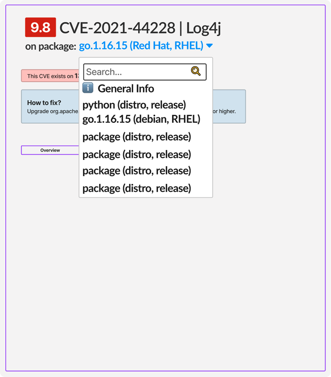
This suggestion seemed confusing as well, particularly because all of the content and context would change dynamically based on a dropdown selection — introducing an additional layer of complexity and potential confusion.
One sidecar to rule them all
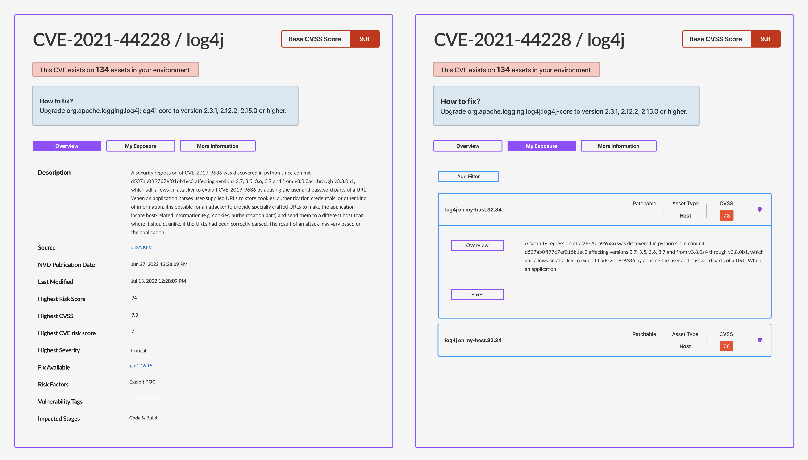
This was the direction we went with. The idea was to have a sidecar with all the information, while allowing the user to land on the appropriate tab based on context.
So if the user is responding to a CVE on a specific asset, they'll land on the My Exposure tab. If the user is performing a general investigation, they will land on the Overview tab.
Context
How users encounter the sidecar
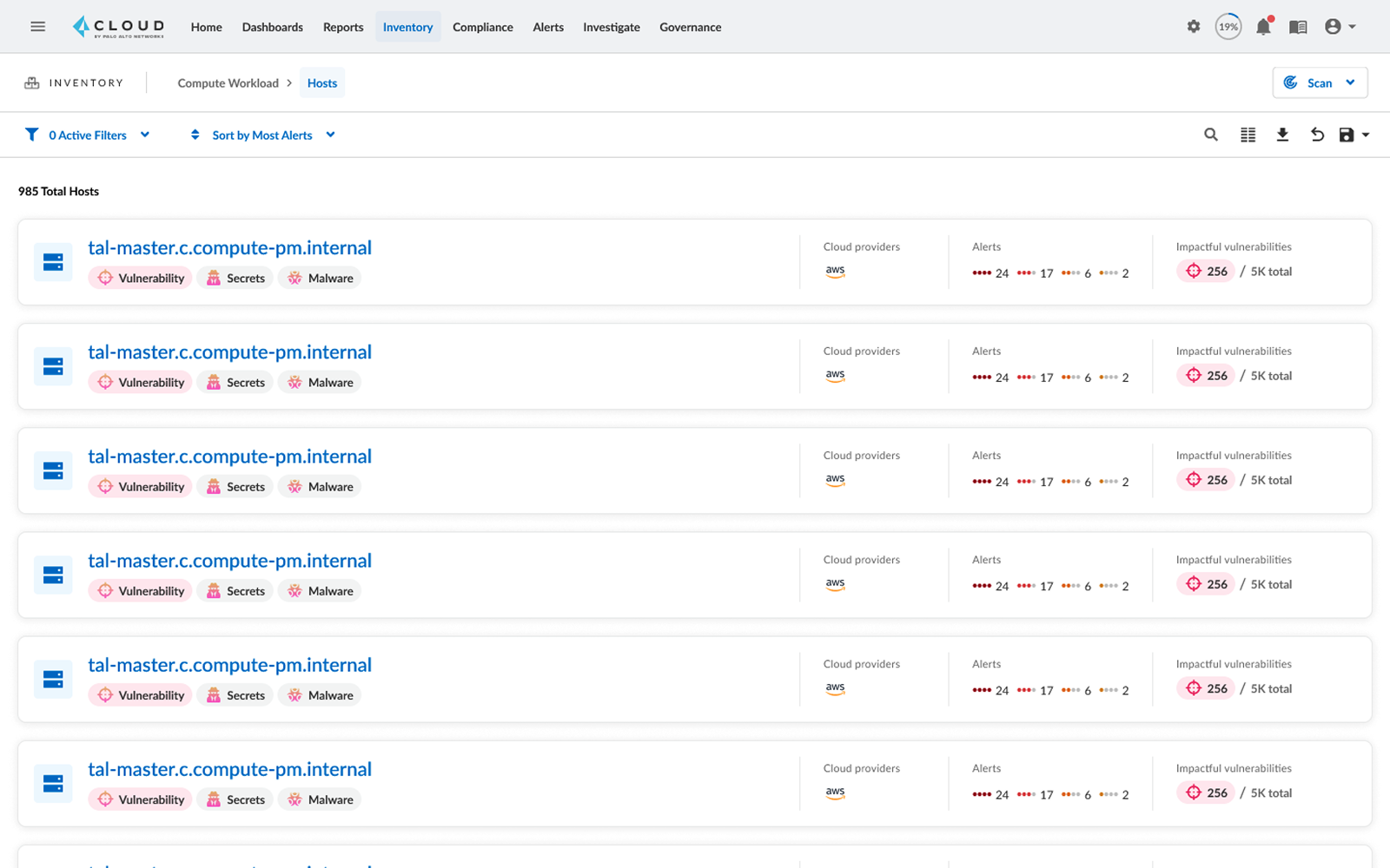
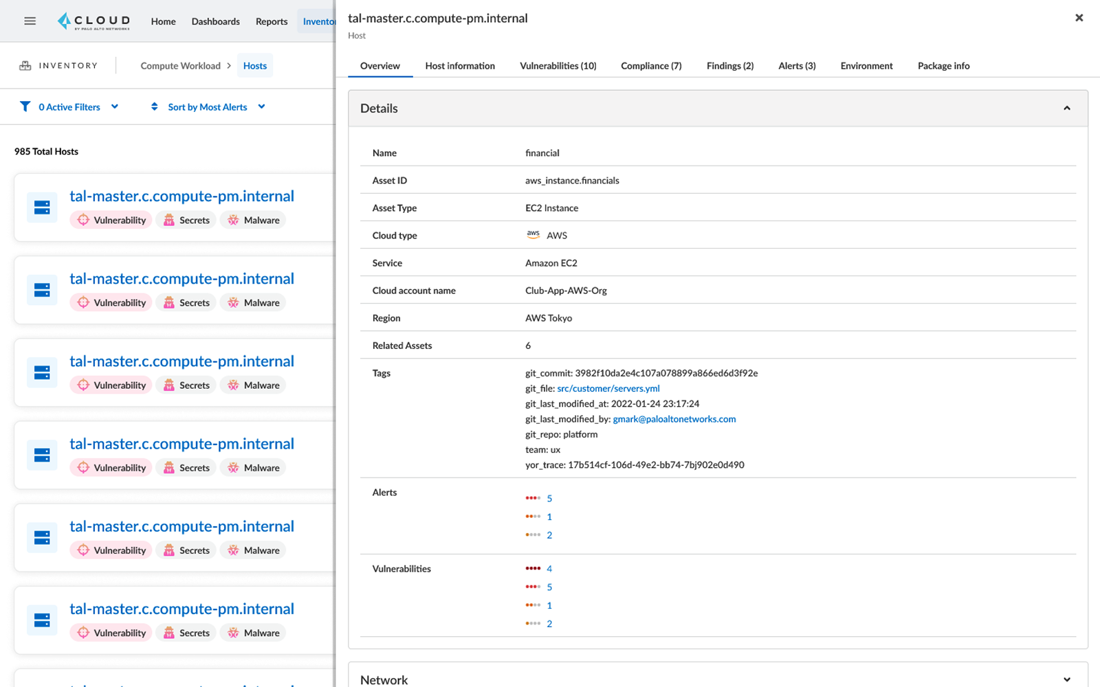
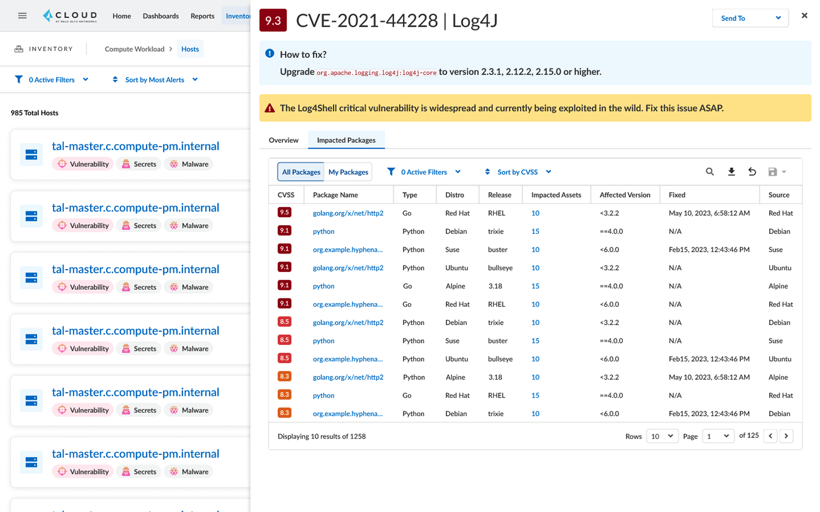
Before diving into the UI design — a quick walkthrough of the product with the initial CVE sidecar.
- The user is looking at their hosts.
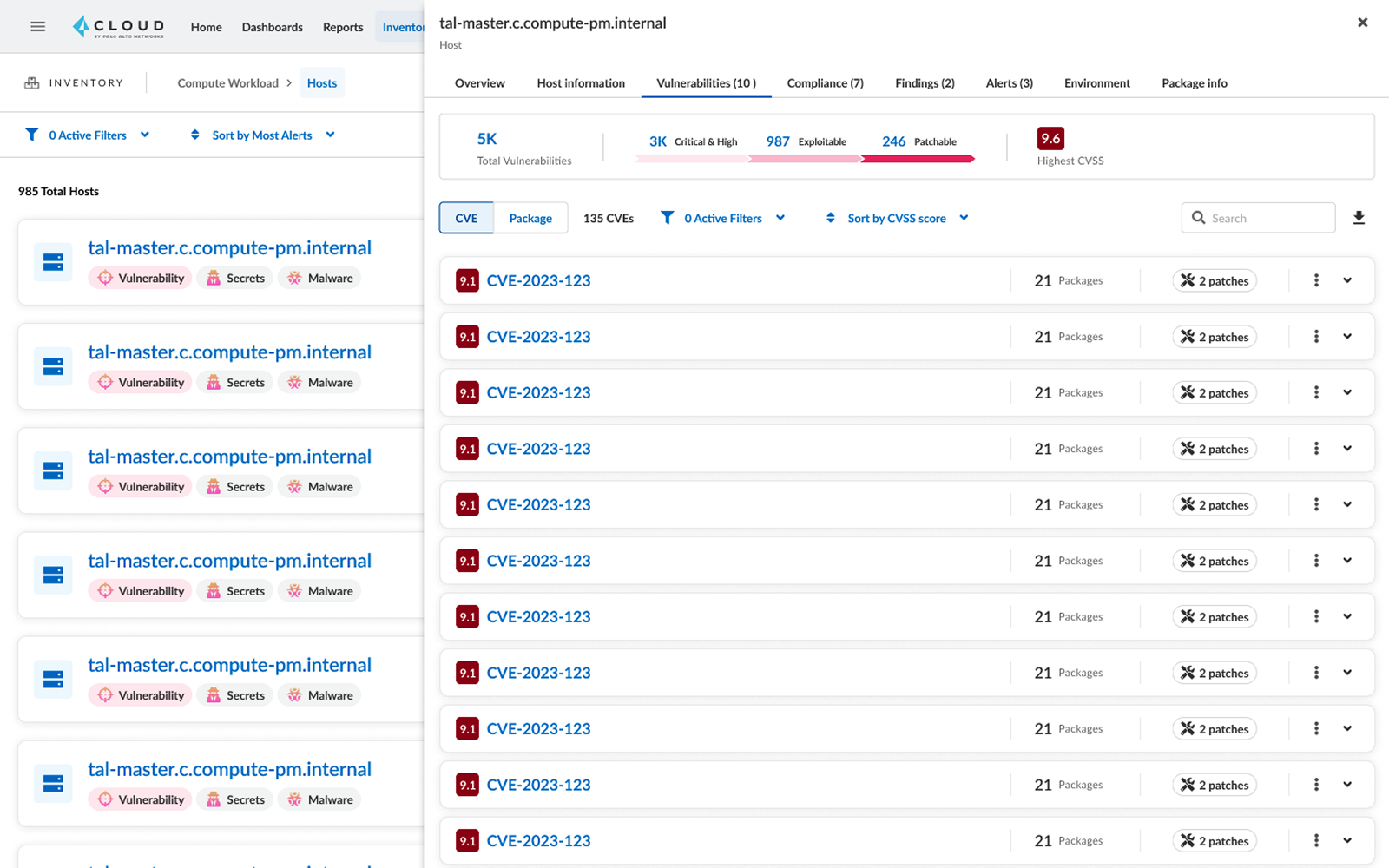
- The user selects one and its sidecar opens.
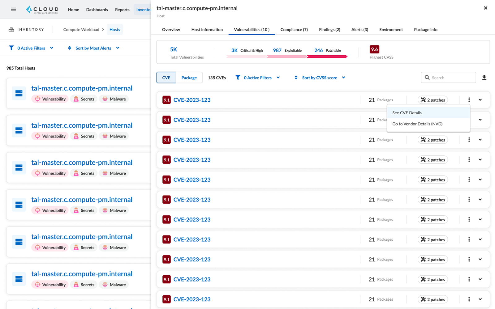
- The user goes to the vulnerabilities tab and expands one of the host's CVEs.
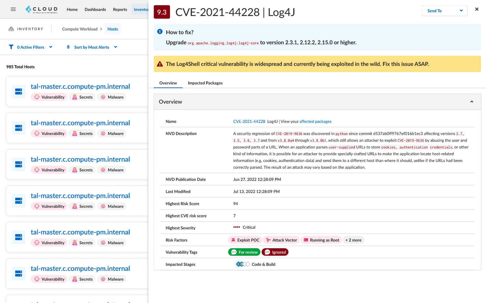
- The user clicks on "see CVE details" and the CVE sidecar opens above the host sidecar.
UI Design
Orchestrating product requirements and user needs
In my UI design work, I synthesised product requirements and user needs to create intuitive interfaces. Through iterative testing, I ensured that the design enhances user experience.
Tweaking the header
The contents of the sidecar were primarily based on components from the design system. Now of course there's always wiggle room but because the sidecar was catered to both use cases I thought the header should carry the weight of telling the user the most important things:
- What's the CVE name?
- How bad is it?
- Can I fix it? How?
Here are a few examples from the process:
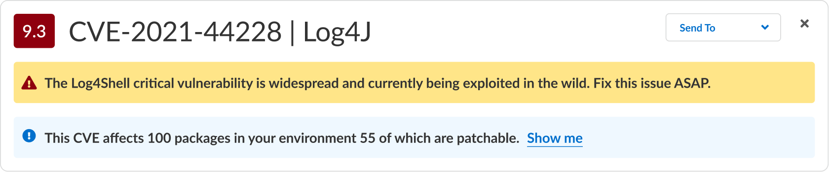
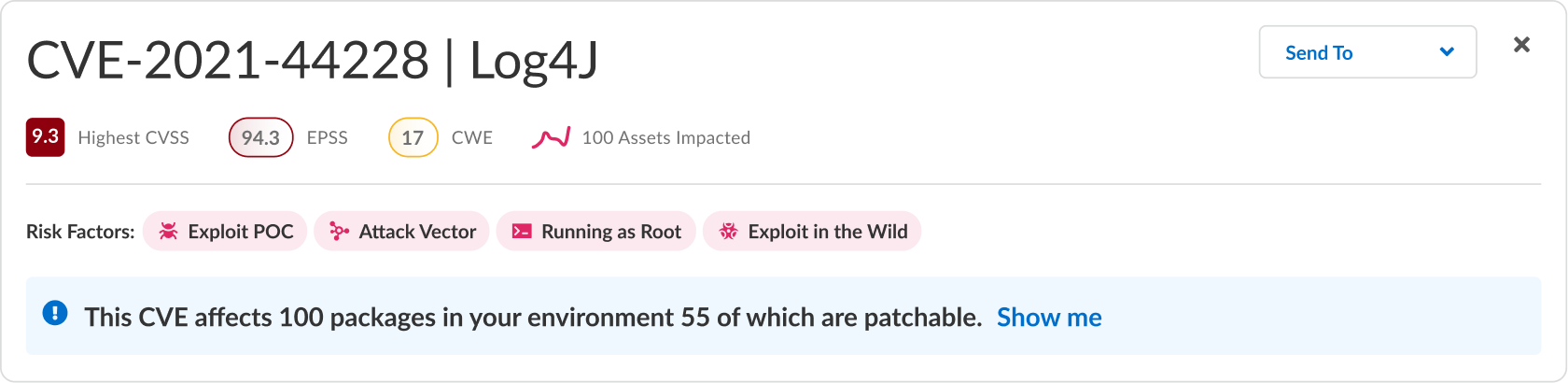



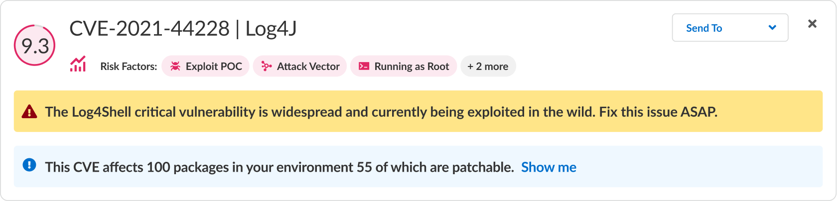





Conclusion: The feedback I received was that the information hierarchy is good but it's missing a key component from our UI — the big blue button. We've tried to create big blue buttons so a user who isn't familiar with our product knows that they can just "follow the blue buttons" to take the next step in our recommended journey.
Based on that I iterated some more:








UI Design
Final designs
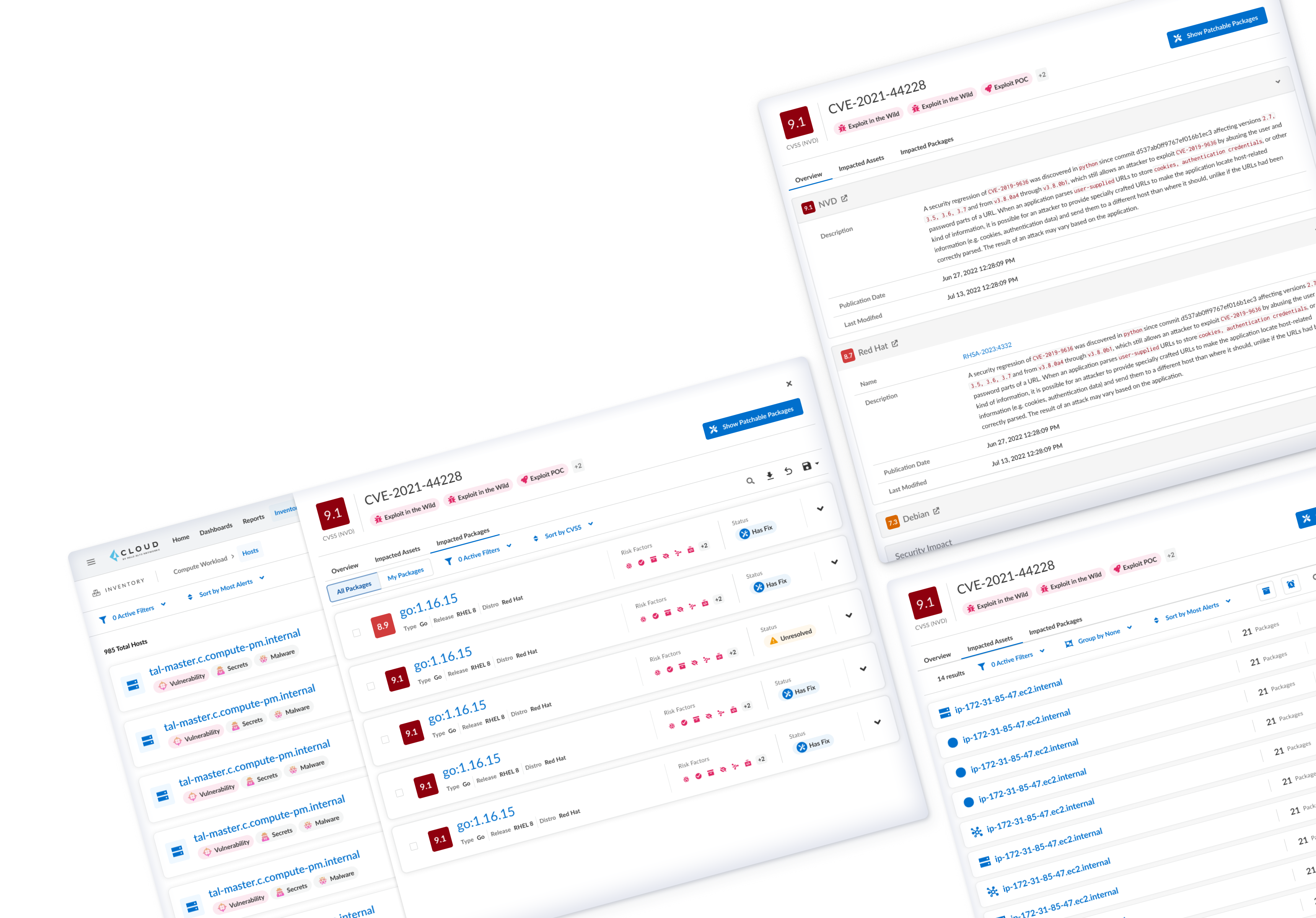
The final sidecar surfaces three distinct tabs — each serving a specific context. The user lands on the right tab automatically based on how they arrived.
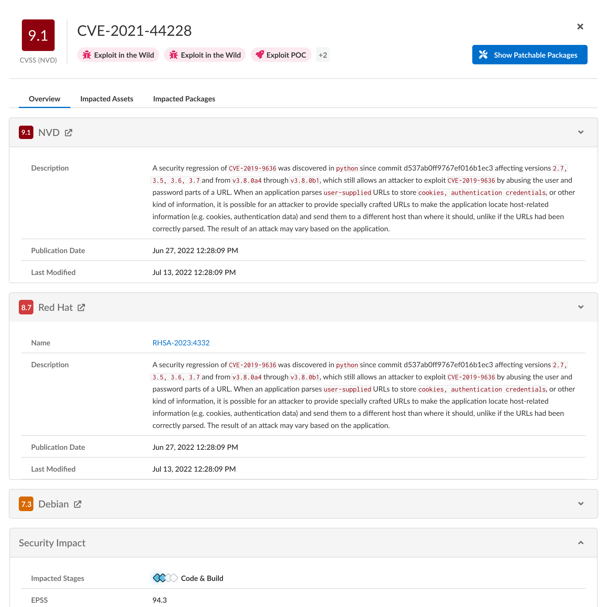
Overview tab
This is the general information tab for an investigating user. It contains data from each vendor with a link to the vendor's database, as well as the vendor's CVSS score. The Common Vulnerability Scoring System provides a numerical (0-10) representation of the severity of an information security vulnerability.
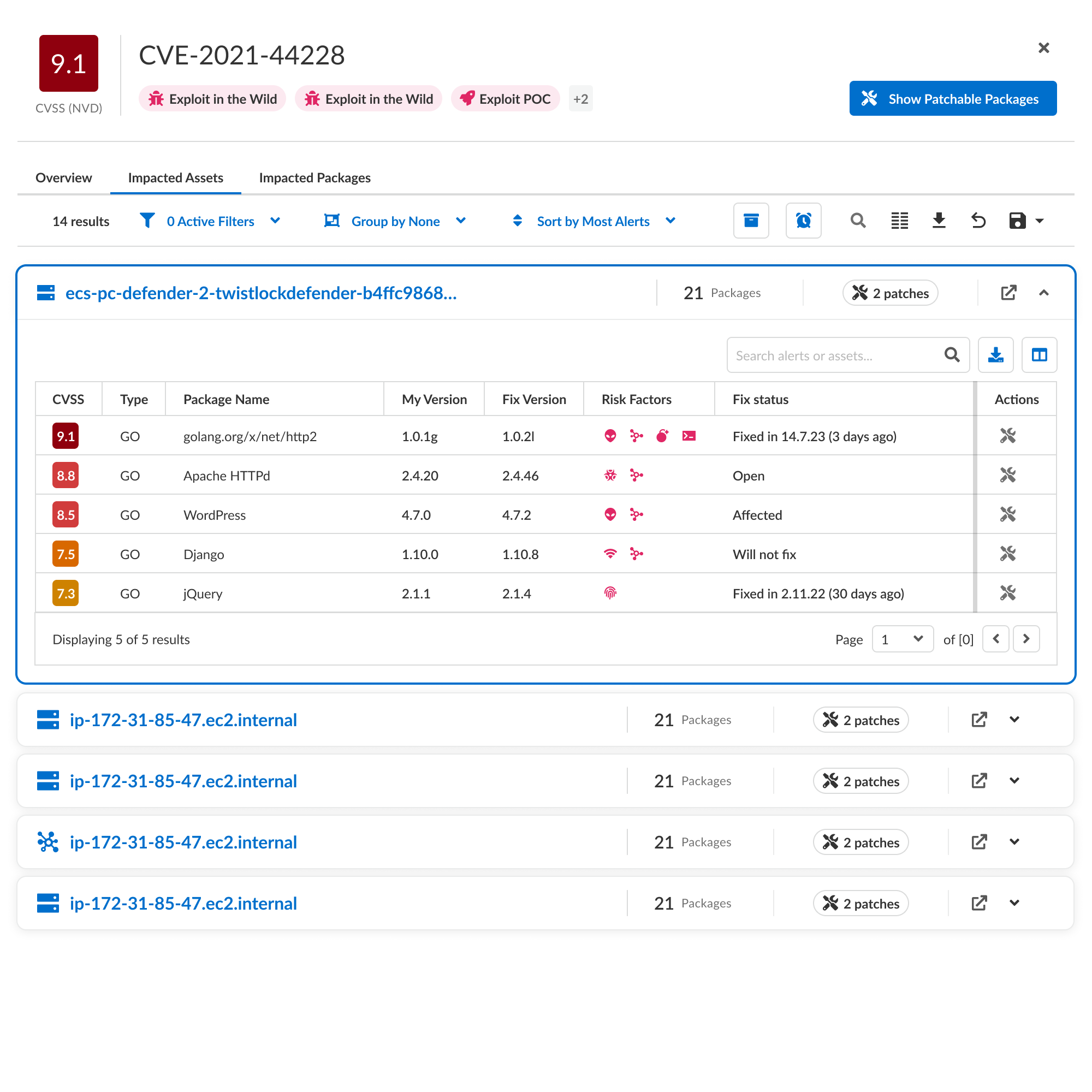
Impacted Assets tab
This tab is for the responding user. Showing the user the assets in their environments that are affected by the CVE. The tab contains a breakdown by asset types such as hosts, clusters, etc. Each asset is broken down by its containing packages and their level of exposure to the CVE.
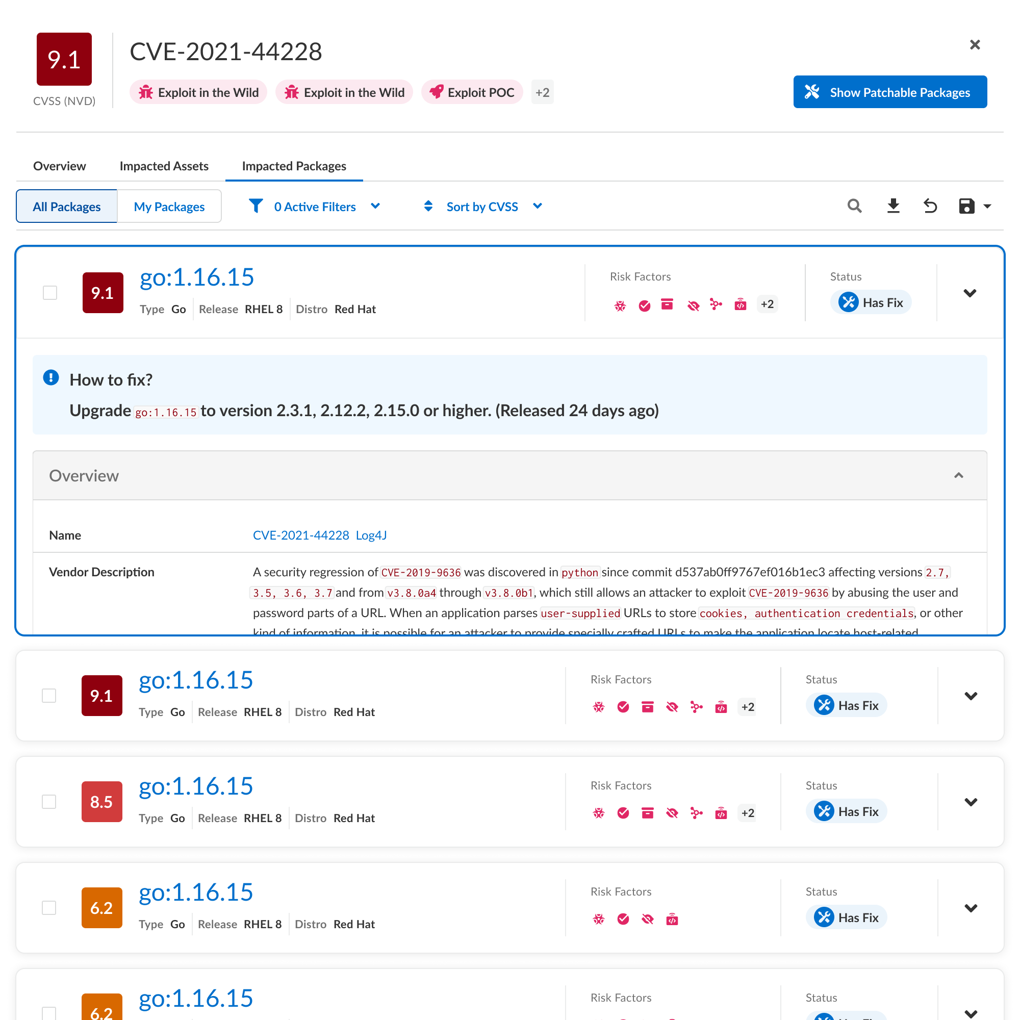
Impacted Packages tab
This tab is a combination for both user types. The investigating user comes here to understand which packages (in general) are affected by the CVE. The responding user might arrive by clicking the "Show Patchable Packages" button, which filters accordingly, or by clicking the "My Packages" toggle.
Each package has a description as well as other details and most importantly a "how to fix" banner.
Final Walkthrough
Here's what the whole flow looks like at the end
Wrapping Up
In concluding the CVE Sidecar project, it's important to emphasize the advancements in UX and UI. Through thorough and meticulous iterations, the interface was refined to provide easier navigation and improved clarity. The UI underwent significant improvements, resulting in a more user-friendly experience. These enhancements not only addressed initial challenges but also enhanced the platform's usability, enabling users to make informed decisions and mitigate security risks effectively.